|
Homepage | Publications | Software; data | Courseware; indicators | Animation | Geo | Search website (Google) |
Mapping excellence in the geography of the sciences:
An approach based on Scopus data
This website is an appendix to the paper: Bornmann, Lutz, Loet Leydesdorff, Christiane Walch-Solimena, & Christoph Ettl (in preparation). Mapping excellence in the geography of science: An approach based on Scopus data. Journal of Informetrics. If you use this method, it is appreciated if you provide a reference to our paper.
In the following, the procedure to map the excellent papers (more precisely: the cities of the authors having published the top 1% most highly cited papers) in a certain field is described (see Leydesdorff & Persson, 2010 and http://www.leydesdorff.net/maps for other mapping options).

Figure 1: The locations of authors in Europe having published highly-cited neuroscience papers in 2007; a clickable version is available here
The procedure is explained for the field of “neuroscience.” In Scopus there are 26 “subject areas” (e.g., “neuroscience” or “biochemistry, genetics & molecular biology”), plus a “general subject area” containing multidisciplinary journals such as Nature or Science available. With the search string “subjarea(neur) and pubyear is 2007 and doctype(ar)” in the advanced search field of Scopus all papers with the document type “article” are retrieved which were published in 2007 within the Scopus journal set of “neuroscience.” At December 1, 2010 this search resulted in 40,086 papers. The search was restricted to articles (as document types) since (1) the method proposed here is intended to identify excellence at the research front and (2) different document types have different expected citation rates, possibly resulting in non-comparable datasets.
By sorting the search results by citation counts in decreasing order (citation window: from 2007 to the date of search), the 1% of papers at the top of the Scopus list can be marked. At the date of search, 405 papers with at least 62 citations each (gathered between 2007 and the date of search) were marked as the list of the top 1% neuroscience papers. (One percent of 40,086 is 401. However, we included ranks which were tied at this 1% level and thus retrieved 405 records.) Once these papers (n=405) have been added to a temporary list in Scopus, the area “Refine Results” on the screen shows the affiliations (research institutions) of the authors in descending order. At the top of the list are those institutions with the highest number of occurrences among the affiliations of the top cited papers.
The selected documents (in the example n=405 papers) are exported by choosing the export format “Comma separated file, .csv (e.g. Excel)” and the output “Specify fields to be Exported.” Only the field “Affiliations” is selected and exported, as follows:
The download in the .csv format and named “scopus.csv” can be processed with the program scopcity.exe. This and the programs mentioned below including the respective user instructions can be retrieved from http://www.leydesdorff.net/mapping_excellence/index.htm (see here also Leydesdorff & Persson, 2010).[1] The programs and the .csv file must be stored in the same folder. Sopcity.exe will prompt the user with the question: “Do you wish to skip the database management? (Y/N).” This question can be answered with “N” (meaning: no). Later on, the user has to answer four questions: with the first and second questions one can set a threshold in terms of a minimal percentage of the total set of city-names in the data or set a minimum number of occurrences. These default answers to the questions (“0”) can be followed. The third and fourth questions enable the user to obtain a cosine-normalized data matrix and to generate network data. Both questions should be answered with “N” (meaning: no) in this case.
The program now creates, among other files, the file cities.txt. This file contains all city entries from the top 1% papers downloaded from Scopus (see here Costas & Iribarren-Maestro, 2007). If there is more than one co-author of a publication with an identical address, this leads to a single address (or a single city occurrence) in cities.txt. If the scientists are affiliated with different departments within the same institution, this leads to two addresses or two city occurrences, respectively. Occasionally it happens by using cities1.exe that some erroneous city entries appear at the beginning of cities.txt (for neuroscience there were 18 errors in the file). These entries start with a comma in the line (e.g. “, Mersey Community Forest”). The errors result from technical inconsistencies in the data formats of Scopus. The erroneous entries in cities.txt have to be deleted. The content of cities.txt can then be copied-and-pasted into the GPS encoder at http://www.gpsvisualizer.com/geocoder/. Since no more than 1000 entries can be processed by the encoder, more than 1000 entries in cities.txt must be entered into the encoder in subsequent steps.
After saving the results in the output window of the geo-encoder as a DOS text file (e.g. geo.txt) this data serves as input for cities2.exe. If geo.txt contains all entries from cities.txt with the additional geo data, the program cities2.exe can be used. First of all the program prompts for the name of this output file (here: geo.txt). Cities2.exe produces a number of output files in various formats within the folder. If cities2.exe is finished cities3.exe can be used as a final step. This program aggregates similar city names with somewhat different geocodes because of different institutional addresses. One can select the grid of the aggregation. Option 1 uses a fine grid: latitudes and longitudes ± 0.01 degree; option 2 uses ±0.1 degree, and option 3 ±0.3 degree in the four directions. Furthermore, this program makes sure that within each map, the circles are coloured according to the number of authors of excellent papers at single cities. The colorization supports the visualisation of the different numbers by different circle radii. The radius is proportionate to the number of papers in the top-10% set. With this feature the viewer of a map may realise faster those cities with the highest (and lowest) numbers. We used the percentile rank approach proposed by Bornmann and Mutz (2011) to colorize the circles.
The percentiles were computed as follows: First, the numbers of papers Xi for the ith city within n cities (of one map) were ranked in decreasing order
X1 ≥ X2 ≥ ... ≥ Xn,
where X1 (Xn) denotes the number of papers associated with city names or, in other words, with the largest (lowest) number of author addresses. Secondly, each city is assigned a percentile rank based on this distribution. If, for example, a single city acquires 50 papers whereas 90% of the other cities have 49 papers or less, then this particular city would be in the (49/50 =) 90th percentile.
All cities (circles on a single map) are categorized into six percentile rank classes and coloured accordingly:
Blue circle: bottom 50% (cities with a percentile less than the 50th percentile),
Cyan circle: 50th – 75th (cities within the [50th; 75th[ percentile interval),
Orange circle: 75th – 90th (cities within the [75th; 90th[ percentile interval),
Pink circle: 90th – 95th (cities within the [90th; 95th[ percentile interval),
Fuchsia circle: 95th – 99th (cities within the [95th; 99th[ percentile interval),
Red circle: top 1% (cities with a percentile equal to or greater than the 99th percentile).
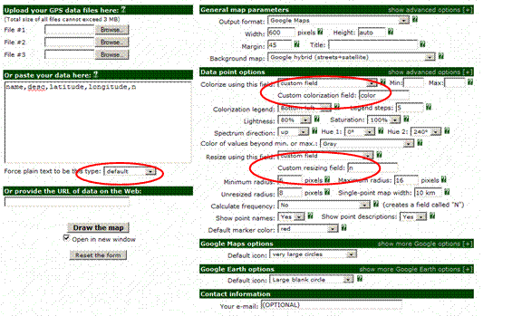
“ucities.txt,” that is, the output file of cities3.exe, can be uploaded into the GPS Visualizer at http://www.gpsvisualizer.com/map_input?form=data. The Web page offers a number of parameters that can be set to visualize the data in ucities.txt. The following parameters should be changed: (a) “waypoints” into “default;” (b) “colorize using this field” into “custom field” and choose “color” in this field; (c) “resize using this field” into “custom field” and (d) in “custom resizing field” “n” is written.
|
|
|
|
|
|
When the GPS data has been processed, the Google map is displayed in a small frame, but it is also temporarily available to view on the full screen. The map shows the regional distribution of the authors of highly cited papers. The background map’s opacity can be adjusted or another layout as available in Google or Yahoo! can be chosen. With the instruments visualized on the left side of the map it is possible to zoom into the map. At the beginning, the global map is shown. For the maps presented in the following we zoomed into Europe in order to generate comparable maps for different publication sets. Similarly, other regional foci can be chosen. To determine the number of papers for a specific city, one can click on the respective city. Maps generated in this way can be copied to other programs (like Microsoft Word) by using programs utilized for screen shots (e.g., Hardcopy). If one uses the download instead of the view command shown in the Google Maps output page, a html-coded page is saved that includes the data of ucities.txt. Opening this page within a browser will regenerate the respective Google Map.
The html file can be edited and brought online after insertion of an API key that can freely be obtained from Google at http://code.google.com/apis/maps/signup.html. In the figures 1 to 5 (http://www.leydesdorff.net/mapping_excellence/figure1.htm, etc.), three of the options were adapted as follows:
gv_options.center = [16,9]; // [latitude,longitude] - be sure to keep the square brackets
gv_options.zoom = 2; // higher number means closer view; can also be 'auto'
gv_options.map_type = 'G_NORMAL_MAP'; // popular map_type choices are 'G_NORMAL_MAP', 'G_SATELLITE_MAP', ...
There are some remaining problems inherent to the approach proposed here. The user should always be aware of these limitations when the approach is applied:
- City name variants (e.g., Zurich and Zrich) in ucities.txt may result in circles that are positioned on one another although they should be combined in one bigger circle. cities3.exe is intended as an error-correction mechanism to reduce this problem; however, it cannot completely be solved using Scopus data. A data cleaning procedure is not provided in our approach automatically, but this can be done by the user manually.
- The methods as described above do not allow for the identification of research institutions on the map where the authors of the excellent papers are located. (A similar procedure scopinst.exe allows for mapping institutions at the street level.)
- Since it can be assumed for certain fields (e.g., the life sciences) that authors at specific positions in the list of authors (e.g., the first or the last authors) have made particularly significant contributions to a publication it would be interesting to include in the analysis a restricted set of authors (e.g. only the first authors). However, this is not possible with our approach.
- If there are a high number of publications visualized on the map for one single city two effects could be responsible: (a) Many scientists located in that city (i.e., scientists at different institutions or departments within one institution) produced at least one excellent paper or (b) one or only a few scientists located in this city produced many influential papers. With our approach – assuming cities as units of analysis – we are not able to distinguish between these two interpretations, but this could be done by studying the Scopus search results after the data has been refined to institutions.
- Because of a systems limit in Scopus only 2,000 papers can be retrieved and downloaded from the Web interface. Thus, fields with more than 2,000 papers among the top 1% – that is, above a total of 200,000 – cannot be visualized using the approach presented here. One may in this case wish to set higher thresholds and study, for example, the 1‰ most highly cited papers.
References
Costas, R., & Iribarren-Maestro, I. (2007). Variations in content and format of ISI databases in their different versions: The case of the Science Citation index in CD-ROM and the web of science. Scientometrics, 72(2), 167-183. doi: 10.1007/s11192-007-1589-z.