|
Homepage | Publications | Software | Courseware; indicators | Animation | Geo | Search website (Google) |
Which cities produce worldwide more excellent papers than can be expected?
A new mapping approach—using Google Maps—based on statistical significance testing
This website is an appendix to the paper: Lutz Bornmann and Loet Leydesdorff, “Which cities produce excellent papers worldwide more than can be expected? A new mapping approach—using Google Maps—based on statistical significance testing,” Journal of the American Society for Information Science and Technology, (in press; DOI: 10.1002/asi.21611), (preprint version available at http://arxiv.org/ftp/arxiv/papers/1103/1103.3216.pdf). If you use this method, it is appreciated if you provide a reference to our paper.
The methods presented below allow for a spatial analysis revealing centers of excellence around the world. Based on Web of Science (WoS) data, field-specific excellence can be identified in cities where highly-cited papers were published. We propose a procedure which considers the total numbers of papers and the most-highly cited ones in order to assess the outcome for a city. The procedure can be run by using programs which a freely available on the Internet and easy to handle. The results can be visualized as overlays on Google Maps and thus one can show for each city with at least a single excellent paper how large the difference between observed and expected (in case of randomly selected) highly-cited papers is.
We focus on the top-10% of most highly-cited papers. In the following, the procedure to map the cities of the authors having published the top-10% most highly cited papers in a certain field is described in sufficient detail so that one is able to reproduce these methods at one’s own discretion. The procedure is explained here below for the field of “chemistry”. With the search string “PY=(2008) AND Document Type=(Article). Timespan=All Years. Databases=SCI-EXPANDED” in the advanced search field of WoS (v5) a large sample papers with the document type “article” are retrieved which were published in 2008. The timespan “all years” is used because papers published in 2008 may have been entered into the database in other years for technical reasons. Let us restrict the search to articles (as document types) since (1) the method proposed here is intended to identify excellence at the research front and (2) different document types have different expected citation rates, possibly resulting in non-comparable datasets.
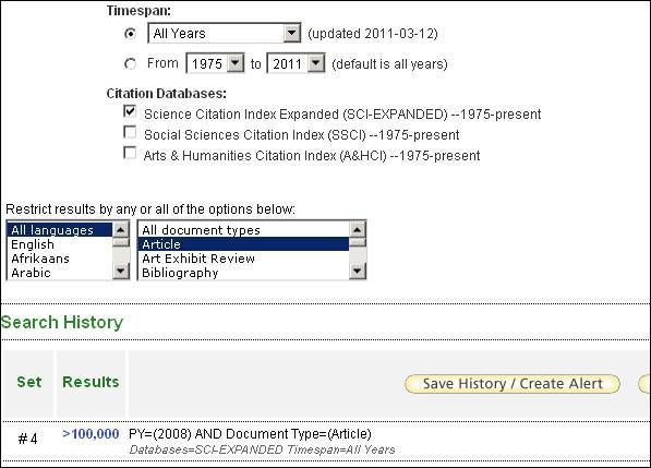
Figure 1
This search results in more than 100,000 papers (date of search: February 2011). To refine the results to a single field, “more options / values...” in “Subject Areas” of the frame “Refine Results” can be clicked. When all “subject areas” (these subject areas are also called journal sets or clusters of similar field-specific journals) have been made visible on the screen, the subject areas are sorted alphabetically. For the field chemistry, let us select all subject areas which begin with the word “Chemistry;” as follows:
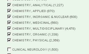
Figure 2
The selection of these chemistry categories results in a sample of 10,460 articles in total. Given the systems limitation of 100,000 records in the ISI WoS, this sample of 10,460 is sufficiently large to warrant statistical inferences about the significance of results. Note that this number is different from the sum of the articles for the single categories since some articles are categorized by Thomson Reuters in more than a single subfield of chemistry. The 10,460 papers (full records plus cited references) can be saved in packages of 500 articles each as plain text (e.g., savedrecs500.txt). The resulting 21 packages are then merged into a single file “data.txt” (see here the instructions on http://www.leydesdorff.net/software/isi/index.htm). This file is stored on the disk in a separate folder.
The following procedure should be followed. (Previously, we used a two-stage procedure that can be found here.) The programs cities1.exe and cities2.exe can be downloaded from the website into the folder. These and the program mentioned below including the respective user instructions can be downloaded from http://www.leydesdorff.net/maps. Upon running, cities1.exe will prompt the user with the question: “Do you wish to skip the database management?” This question should be answered with “N” (meaning: no). Later on, four questions follow: with the first and second questions one can set a threshold in terms of a minimal percentage of the total set of city-names in the data or set a minimum number of occurrences. The default answers to the questions (“0”) can all be accepted. The third and fourth questions enable the user to obtain a cosine-normalized data matrix and to generate network data. Both questions can for our purpose be answered with “N” (meaning: no).
The program cities1.exe creates among other files the file named cities.txt. This file contains all city entries from data.txt, but organized so that this data can be “geo-coded,” that is, provided with latitudes and longitudes on a map. If more than a single co-author of a publication with an identical address is included, this leads to a single address (or a single city occurrence) in cities.txt. If the scientists are affiliated with different departments within the same institution, this leads to two addresses or two city names, respectively.
The content of cities.txt can be copied-and-pasted into the GPS encoder at http://www.gpsvisualizer.com/geocoder/. Since no more than 1000 entries can be processed by the encoder, larger number of entries in cities.txt may have to be entered into the encoder in subsequent steps. Choose the (default) Yahoo! format for the encoding. (Geo-coding can be done automatically using the Sci2 Tool available at https://sci2.cns.iu.edu/user/download.php. However, note that my programs assume the ASCII format of gpsvisualizer for the input; use Ctrl-A and Ctrl-C, Ctrl-V, and save geo.txt as simple ASCII or DOS-file; e.g.: ‘48.202548,16.368805,"Vienna, Austria",-,’)
After saving the results in the output window of the geo-encoder as a DOS text file (e.g., “geo.txt”) this data can serve as input to cities2.exe. If geo.txt contains all entries from cities.txt with the additional geo data, the program cities2.exe can be used. This program first prompts for the name of this output file (in this case: geo.txt) and then produces a number of output files in various formats within the same folder, among which the file “inp_gps.txt”. This file is in the format so that it can be used for the generation of overlays to Google Maps and Google Earth at http://www.gpsvisualizer.com/map_input?form=data.
In a final step, we proceed to the statistics. The program Topcity2.exe first asks for a percentile level. If significance is tested for papers defined as the top-10% of the most cited papers (as in this study), ten percent (the default) should be entered. The file “ztest.txt” is the output file of topcity2.exe, and can be uploaded into the GPS Visualizer at http://www.gpsvisualizer.com/map_input?form=data. (We use the binomial Z-test as the significance test, for reasons to be explained below.
This webpage offers a number of parameters that can be set to visualize the data in “ztest.txt.” We advise to change the following parameters as follows: change (a) “waypoints” into “default;” (b) “colorize using this field” into “custom field” and choose “color” in this field; (c) “resize using this field” into “custom field” (d) in “custom resizing field” “n” is written and (e) at “Maximum radius” replace 16 with 30.
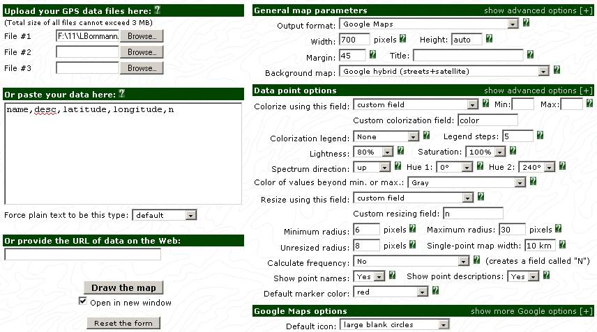
Figure 3
After processing the GPS data, the Google map is displayed first in a small frame, but this map is also available as full screen. The map shows the regional distribution of the authors of highly cited papers (cities with authors who published at least one excellent paper). The background map’s opacity can be adjusted or other layouts are available in Google or Yahoo!. With the instruments visualized on the left side of the map one can zoom into the map. (Initially, the global map is shown.) For the maps presented here below we zoomed into Europe in order to generate comparable maps for different publication fields. However, other regional foci can also be chosen at http://www.leydesdorff.net/topcity/figure2.htm.
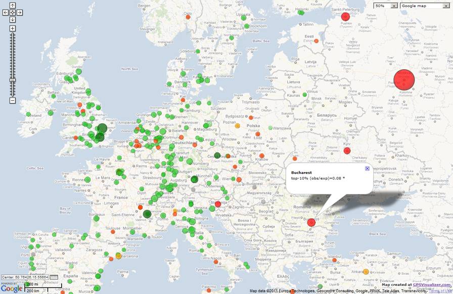
Figure 4. Locations of authors in Europe having published highly cited chemistry papers in 2008;
a clickable and zoomable map is available online at http://www.leydesdorff.net/topcity/figure2.htm.
Similar figures are also available for physics and psychology.
In order to determine the ratio of observed and expected numbers of excellent papers for a specific city, one can click on the respective city. These numbers are then displayed in the respective labels. Maps generated in this way can be copied to other programs (like Microsoft Word) by using programs utilized for screen shots (e.g., using the PrtScr key, Screengrab! in Firefox, or another program such as Hardcopy). If one uses the download instead of the view command shown in the Google Maps output page, a html-coded page can be saved that includes the data. Opening this page within a browser will regenerate the respective Google Map. Additionally, one can ask Google Maps for an API (free) and upload the file at one’s homepage.
Two problems are inherent to the approach proposed here. The user should always be aware of these limitations when this methodology is applied. (1) The methods as described above do not allow for the identification of research institutions on the map where the authors of the excellent papers are located. (2) If there are a high number of publications visualized on the map for one single city two effects could be responsible: (a) many scientists located in this city (i.e., scientists at different institutions or departments within one institution) produced at least one excellent paper or (b) one or only a few scientists located in this city produced many influential papers. With the approach in this study – assuming cities as units of analysis – one is not able to distinguish between these two interpretations.
Statistics
The binomial Z-test can be used for indicating whether an observed number of top cited papers for a city differs from the value that would be expected on the basis of the null hypothesis. If excellent papers are defined as the top-10% most-highly cited papers in a field, on the basis of the null hypothesis a value of 10% of all papers published from a city would be expected as belonging to this category.
The binomial Z is a version of the standard normal deviate, Z, calculated as follows (e.g., Diekman, 1995, at p. 709; Sheskin, 2011, at p. 656):
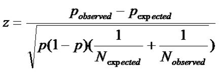
![]()
Where:
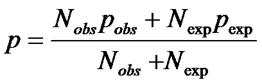
Z is positively signed if the observed number of top papers is larger than the expected number and negatively signed in the reverse case. If the expected value for a city is at least 5, the chi-square approximation can be considered as valid and the statistical significance of Z is thus tested. An absolute value of Z that is larger than 1.96 indicates statistical significance at the five percent level (p<.05) of the difference between observed and expected numbers of top-cited papers. In other words, the authors located at this city are outperformers with respect to scientific excellence in terms of this statistics.
Using this statistical procedure, we designed the city circles which are visualized on the map using different colours and sizes. The radii of the circles are calculated by using:
abs(observed value – expected value) + 1
The “+1” must prevent the circles from disappearing if the observed ratio is equal to the expected one.
Additionally, the circles are coloured green if the observed values are larger than the expected values. We used dark green if both the expected value is at least five (and a statistical significance test is reasonable) and Z is statistically significant; light green indicates a statistically non-significant result. The in-between colour of lime green is used if the expected value is smaller than 5 and a statistical significance test hence should not be calculated.
In the reverse case that the observed values are smaller than the expected values the circles are red or orange, respectively. They are red if the observed value is significantly smaller than the expected value and orange-red if the difference is statistically non-significant. If the requirement for the test of an expected value larger than five is not fulfilled the circle is coloured orange. If the expected value equals the observed value a circle is coloured grey.
When one clicks on a city which is coloured dark green or red (that is, significant), the number of asterisks in the label indicates the significance level with * for p < 0.05; ** for p < 0.01, and *** for p < 0.001, respectively.
Further extensions
Topcity3.exe provides the same functionality as topcity2.exe (above), but the analysis is not limited to the cities in the top-10% set. Thus, a zero is evaluated for cities without papers in the top-10% range. These cities can never be coloured green because the expected value is always above zero, namely, 10% of the total number of records in the original set.
Topinst3.exe provides the same functionality as topcity3.exe, but builds on inst1.exe and inst2.exe analogously, using WoS data. Because institutional data are distinguished at the street level, one institution with two different addresses (correctly or mistakenly) can either be aggregated at both addresses (default) or be sorted apart using inst2.exe. (The user is prompted for this choice.) Topcity3.exe (hitherto) uses the aggregated option.
Topcity4.exe calculates the percentiles for each publication year separately. This normalization is adviced when older publications in a set can be expected to have a longer citation window. Topicity4.exe also uses the modification proposed by Rousseau (2011): the quantile value is equal to the number of papers with “times cited” ≤ the “times cited” of the paper under study divided by the total number in this set; the equal sign is added so that each paper can reach the top value of 100%.)
References:
· Diekman, A., Empirische Sozialforschung: Grundlagen, Methoden, Anwendungen. Reinbeck bei Hamburg, Rowohlt, 1995/2010.
· Ronald Rousseau, Percentile rank scores are congruous indicators of relative performance, or aren’t they? Journal of the American Society for Information Science and Technology (in press).
· Sheskin, D. J., Handbook of Parametric and Nonparametric statistical Procedures, Boca Raton, FL: Chapman & Hall/CRC, 2011.