Hands-on class on Science & Technology Indicators,
28 March 2007
Today, we focus on scientific publications and relations
among them like coauthorship relations, cocitation relations, etc. (The class
follow on the introductory class about patent searching at http://www.leydesdorff.net/td/indicators.htm.)
The scientific publications are harvested from the Web-of-Science of the
Go to “advanced search”. Let’s search for “AU=(blume s* OR amsterdamska
o* OR leydesdorff l* or wyatt s* OR grin j*) AND CI=
Go back to the listing. On the right side is a screen that enables you to “Analyze Results” and to make a “Citation Report”. The citation report, for example, informs you about the development over time. The picture raises questions. Can you formulate one? Is it perhaps relevant that the Department of Science & Technology Dynamics was dissolved in 1999/2000? The tab “Analyze Results” allows you to generate distributions. Make a distribution of the authors in this set.
In a next step we will now download the records in order to proceed with more options for the scientometric analysis. To that end, enter the total number of records (1 to 100+) in the third option under “Output Records”. Then click on “Add to Marked List”.
Enter the “Marked List” at the top of the screen and save the records to file after tagging all the fields that may be of interest to us in a later state. (Take them all.) The computer now saves the records and thereafter you can save them in a folder as “data.txt”. (We shall use this name and not “savedrecs.txt” because my programs assume the name data.txt.) If your browser does not allow you to use another name, rename the saved file, please, into data.txt.
Go to http://www.leydesdorff.net/software/coauth/index.htm . Read the page and save the program in the same folder in which you saved the data as data.txt. (I assume that this is the folder C:\temp.) Run the program.
The output file cosine.dat can be used for Pajek, a freeware program for network visualization. Download it at http://vlado.fmf.uni-lj.si/pub/networks/pajek/ and install it at C:\pajek (or the desktop). Run your set with coauth.exe, open Pajek, and read the file “cosine.dat” into the program (by using File > Network > Read). Go to “Draw” and draw the figure. Explore the options. Use under “Layout” > Energy > Kamada-Kawai.
You will see that there are three networks of authors in this data. The size of the nodes is set proportional to the logarithm of the frequency of the authorship in the data. The three colours are generated using the partition algorithm in Pajek. All algorithms in Pajek are to be found under “Net” in the main menu. Since these are three separate domains, one can use: Net > Partition > Domain > All. Run Draw > Partition. You can adjust the colours and the size of the elements under Options.
The cosine is a similarity measure very similar to the Pearson correlation coefficient.[1] The cosine can vary between zero and one. If one uses one for the line width (under Options > Size) all lines are similar. I found 3 a good value for line width, and I use 10 for font size. (Set arrow size to zero.) Try to make a similar picture.
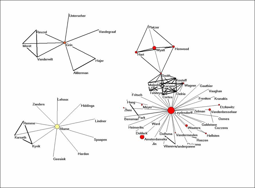
Figure 1: coauthorship network in the set downloaded on March 20, 2007.
Let us now use the program BibJourn.EXE in a similar way to see which journals are cited by these authors. One might consider this as the knowledge base of the articles (Leydesdorff, 2007). You find this software at http://www.leydesdorff.net/software/bibjourn/index.htm. When you run the program on the same file data.txt, you will note that it takes too long. For this reason, I made the file cosine.dat which is the output of this routine available as bibjourn.txt. Can you read it into Pajek and make an interesting analysis?
The problem is that too many journals are cited by these authors (> 500) for a nice visualization. However, we can turn off the labels and the different line widths, and we can raise the threshold for the cosine value so that weak connections are no longer visible.
Net > Transform > Remove > lines with value lower than 0.5. This should provide you with a picture which shows you the different clusters as in Figure 2. In Figure 2, I highlighted the environment of Research Policy by choosing under Net > k-neighbourhood > <number for Research Policy> > distance is 1. The sequence number of Research Policy can be found under File > Partition > Edit. (You first need to create a partition for this, for example, Net > Partition > Core > All.)
The k-neighbourhood algorithm generates a new partition in which the seed journal is partition 0, the linked ones are partition 1, and the other journals have higher numbers. Using Partition > Make cluster > Select clusters: 0-1, you can add this partition as a cluster. A cluster can be labeled separately in the figure under Options > Mark Vertices using > . Try to conceptualize analytically what is represented here precisely.

Figure 2: k = 1 environment of Research Policy; N
= 528; cosine ≥ 0.5
Alternatively, you can extract the partition from the larger set using Operations > Extract from network > Partition 0-1 (or Cluster). The subset can be visualized independently. Try to generate Figure 3 for Social Studies of Science and its environment within this set of citing documents.
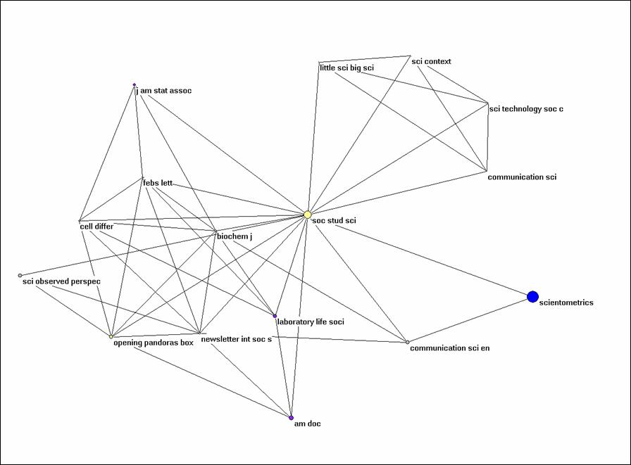
Figure 3: k = 1 environment of Social Studies of
Science (N = 16; cosine ≥ 0.5).
Let us finally turn to Bibcoupl.EXE which is available at http://www.leydesdorff.net/software/BibCoupl/index.htm. This program enables you to visualize the shared reference patterns between authors. It works like the previous programs and it should provide you with an equivalent to Figure 4. Try to generate this picture. Note that the files like cosine.dat can be edited using an ASCII Editor like NotePad (under Accessories in Windows) so that you can also correct for lower and upper case. You can also edit in partitions within Pajek.
The file cosine.dat is also available here as bibcoupl.txt.
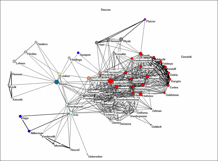
Figure 4: bibliographic coupling of the 61 authors part of the coauthorship network.
Why would it be possible to get such a clear picture when we use the full references and such on overwhelming number of journals when the journal names in these references are used (Figure 2)? Would you expect this to be the case in the natural sciences as well or is it specific for this field? Can you provide Figure 4 with an interpretation?
SPSS
The files which are produced by the routines are so-called dBase-files. This is an old format, but it can be read by MS Office and SPSS. Let us first import the data matrix which is the basis for the analysis into SPSS. Open SPSS. File > Open > Data > C:\temp\matrix.dbf. (You can find this file also here as bibcoupl.dbf.) Change the window to the data view (if necessary).
This matrix is a citation matrix (in the citing direction). Each row represents one of the ( > 2500) cited documents and the columns correspond with the citing (co)authors in the set. The cosine matrix is created by comparing the distributions over the columns.
You see that the matrix has many empty cells and SPSS wants zeros on these empty places. We do this with Transform > Recode into same variable > bring all variable except the first one to the right side > Old and new values > system- or user-missing > Value : 0 > Add > Continue > OK.
SPSS offers a wealth of possibilities for further analysis, but let’s limit it here to a simple example. Let us ask for the correlation in citing patterns among our five initial protagonists of the search. Analyze > Correlation > Bivariate > bring the five names to the right side and click OK. The Pearson correlation matrix is generated. What do you see? Can you interpret this result? Write a single paragraph and hand this in with the mid-term exam. (Similarly, but a bit more complex you can generate the cosine matrix using SPSS.)
We exit SPSS.
Excel
The various programs like coauth.exe, bibcoupl.exe, etc., all begin with sorting the data into different databases which can then be related using relational database management. Relational database management is provided within MS Office by the program Access, but let’s first explore the structure of these databases using Excel (because most users are more familiar with Excel than with Access).
Read the file core.dbf into Excel. This file contains all the unique information in the 100+ records. Each record has a number in the first column. The authors are not unique. They are in the file au.dbf. Open that one, too, in order to see that the numbers are repeated for coauthorships.
Return to the file core.dbf. This file contains also the field TC which provides the times cited at the time of the download (that is, today). We can crosstable this value, for example, with the journal names. Data > PivotTable > three times return and we are in a pivot table. Drag “SO” to the row fields, “DT” to the column fields, and “TC” to the Data Items. Click on the icon for a bar chart in the PivotTable bar. You obtain a stacked bar chart. If you right click on the figure, you can change the Figure Type. Can you provide the results with an interpretation?
Let’s return to au.dbf and do a very simple pivot table in order to do a frequency count. (This can also be done in SPSS.) Data > PivotTable, etc., drag AU to column and NR to Data Items. You can visualize the order using a figure, but in that case you should first sort in descending order. This is a bit similar to what we did originally within the Web-of-Science.
Access
Access allows us to work with queries that relate data from different tables; for example, we can do a citation count in the one file and relate to author names in the other. Since these files are not Access files, they have to be imported. First, close Excel in order to prevent sharing errors. Open Access and choose the option to create a Blank Access Database and save it. To import tables, choose File > Get External Data > Import. We import both core.dbf and au.dbf. (You have to ask under “File types” for dBase files or to type under “File name”: “*.*”.)
Now we have to relate them using the field “NR” which they have both in common: Tools > Relationships. Add the two databases and drag the relationship from NR in the one file to NR in the other. If you get a pop-up window to edit relationships create the relation without choosing “enforce referential integrity” since you have not identified a Unique key for each of the tables.
Once this is done, we can go back to the submenu for the database and begin a Query. Use the Query wizard and the fields au from the Table AU and the field ti from the Table Core. All authors are now related to their papers.
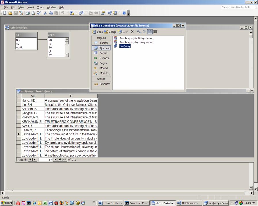
Figure 5: Screenshot of the configuration in Access.
Sort the data as shown in Figure 5 and select the titles for Blume and Leydesdorff, respectively. You can do this selecting the lines and pasting them in NotePad or you can choose to put under the query’s criteria “Leydesdorff, L” and then under it “Blume, S”, save the query and export it as text type file. Whichever way you choose, the files should be named stuart.txt and loet.txt and we will use them next time for co-word analysis.
You can run a similar query for authors and times cited. Let us make a new query using the Design View. First, add the two Tables to the query and close the window. Thereafter, you select Authors (au) from AU table (by clicking on it) and the times each document is cited (TC) from the core table. To find the total times cited choose View > Totals op de balk bovenaan. You get an additional line in your query with the caption “Total.” Click in the field “Grouped by” and group the Times Cited with Sum. Now run the Query using the red exclamation mark in toolbar. The table which is generated can be exported to Excel and an Excel-file can directly be read into SPSS. Make an interesting and informing figure using one of the programs.
Let us summarize what we have learned today. Write that down on half a page; it is part of the midterm.
See you next week! Please read for next week as an introduction my paper with Iina Hellsten, Measuring the Meaning of Words in Contexts: An automated analysis of controversies about 'Monarch butterflies,' 'Frankenfoods,' and 'stem cells.' Scientometrics 67(2), 2006, 231-258. <original pdf-version from journal>.
[1] While the Pearson correlation coefficient normalizes for the arithmetic mean of the distributions, scientometric distributions like these are not normal and therefore a non-parametric measure like the cosine is preferable.