|
Homepage | Publications | Software; data | Courseware; indicators | Animation | Geo | Search website (Google) |
How can one visualize an asymmetrical (e.g., factor) matrix using Pajek?
In addition to visualizing a symmetrical (1-mode) matrix, Pajek and similar network visualization programs (e.g., UCINet) enable us also to visualize an asymmetrical (2-mode) matrix. For example, Shi & Leydesdorff (2011) provide the following rotated factor matrix as Table 4:
Table 1. Rotated Component Matrix of the citing journal matrix with Adv. Atmos. Sci. as the seeding journal (Extraction Method: Principal Component Analysis. Rotation Method: Varimax with Kaiser Normalization, and Rotation converged in 4 iterations).
|
|
Component |
||
|
|
1 |
2 |
3 |
|
Climate Dynam. |
0.924 |
0.184 |
|
|
J. Climate |
0.921 |
0.244 |
|
|
Int. J. Climatol. |
0.86 |
|
|
|
Bound.-Lay. Meteorol. |
0.759 |
0.307 |
0.377 |
|
Adv. Atmos. Sci. |
0.742 |
0.521 |
0.218 |
|
Q. J. Roy. Meteor. Soc |
0.141 |
0.856 |
|
|
J. Atmos. Sci. |
|
0.819 |
|
|
Mon. Wea. Rev. |
0.156 |
0.786 |
-0.166 |
|
J. Meteorol. Sco. Jpn. |
0.421 |
0.671 |
-0.102 |
|
J. Appl. Meteorol. Clim. |
0.138 |
0.649 |
|
|
Bound.-Lay. Meteorol. |
-0.421 |
0.513 |
|
|
J. Geophys. Res. |
0.312 |
0.208 |
0.824 |
|
Geophys. Res. Lett. |
0.466 |
0.138 |
0.799 |
|
Atmos. Environ. |
-0.141 |
|
0.601 |
|
Chinese Sci. Bull. |
|
-0.348 |
0.59 |
|
Acta Meteorl. Sin. |
0.183 |
0.483 |
-0.234 |
|
Science |
|
-0.292 |
0.481 |
This matrix was generated using SPSS v13. The first factor can perhaps be designated as Climatology, the second as Meteorology, and the third as Geophysics. How to visualize this matrix (or any asymmetrical matrix) in Pajek?
First copy and paste the SPSS output containing this matrix into Excel. Within Excel select only the matrix with the labels. The row labels are already provided, but one may wish to edit the column labels (1, 2, and 3), for example, using the factor designations (or more generally, the variable names).
At http://www.analytictech.com/ucinet/download.htm download and install the latest version of UCINet. The program is free for a 30 days trial period. Within UCINet: Data > Data Editors > Matrix Editor, position the cursor into the light blue field at the top-left and paste. The matrix is now read into the editor. Save the file as a UCINet file in a temporary folder; for example, as C:\temp\f3.##h. (A UCINet file will have this extension: ##h.)
Within the main program of UCINet, you can directly go to Visualize > Netdraw and then open under File this file as a 2-Mode UCINet dataset. This will provide the following visualization which can be embellished within NetDraw:
|
|
|
|
|
|
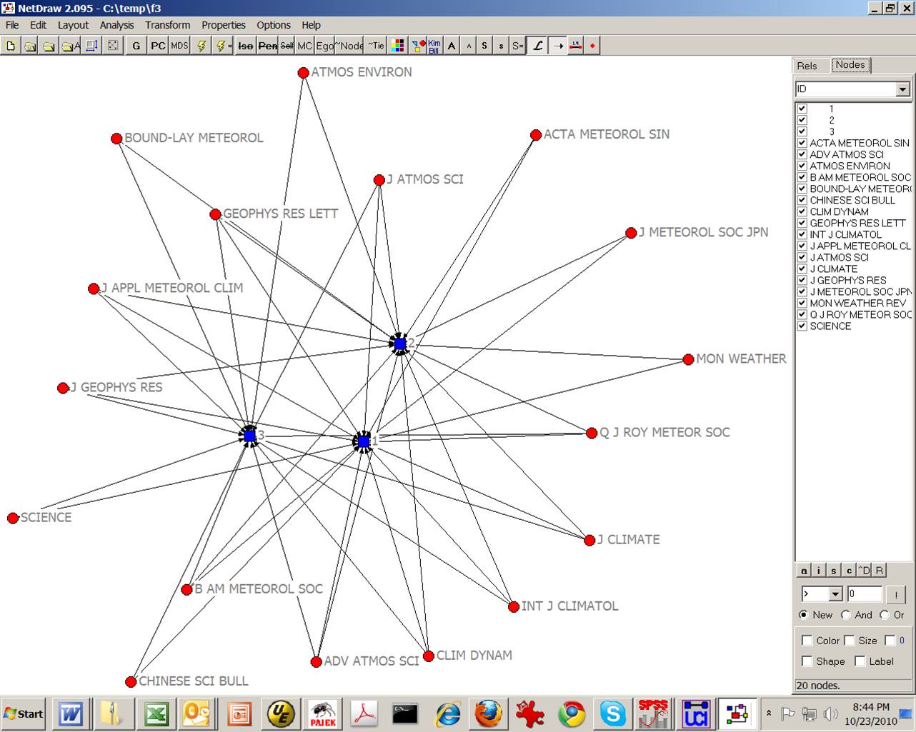
Figure 1: Visualization of the factor matrix of Table 1 using NetDraw
from UCINet.
Alternatively, one can export the data under Data > Export as a DL-file. (DL stands for the “data definition language” of UCINet.) One cannot directly export a 2-Mode matrix to a Pajek .net file (since this option is currently limited to only 1-Mode matrices). Within the menu opening for the export, change the number of decimals which is default set to -1 (that is, no decimals), for example, into 4. Export the file, for example, using in this case the name f3.txt.
Before opening in Pajek, this file requires some editing. For example, UCINet places quotation marks around the labels; you may wish to remove these (using “replace all”). Absent values in the factor matrix will be shown as question marks. Replace all question marks with zeros. You may also wish to capitalize the labels, but this is not really necessary. Save the file after making these adjustments.
Now open the file within Pajek using File > Read. Use Network > Partition > 2-Mode to split the labels. Draw-Partition and use either Kamada-Kawai or Fruchterman-Reingold under the Layout > Energy routines for optimizing the resulting visualization. Do not forget to change under Options (within the drawing menu) > Value of Lines > Similarities (because the factor loading are Pearson correlation coefficients between the variable and the eigenvector). The routine uses the negative factor loading for distancing the nodes. Negative factor loadings are shown as dotted lines.
Figure 2 shows a possible result using Fruchterman-Reingold (2D):
|
|
|
|
|
|
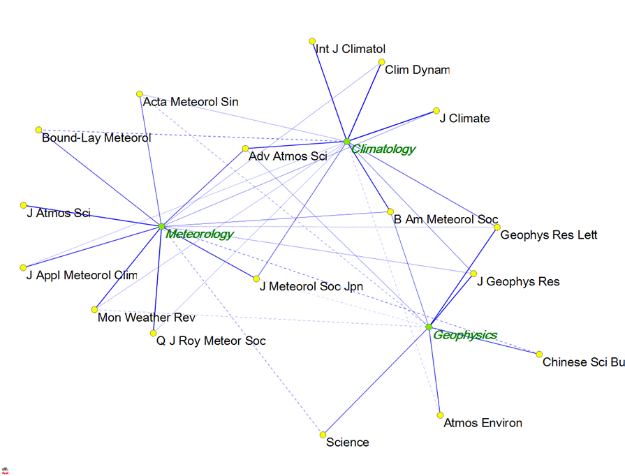
Figure 2: Visualization of data in Table 1 using Pajek (using Fruchterman-Reingold
for the optimization).
The advantage of this representation is that the eigenvectors (factors) are mapped within the same plane as the variables. Adv. Atmos. Sci., for example, is shown as an important articulation point between the group of journals designated as Climatology and the one designated as Meteorology. Experiment with the spring embedded optimalization to find a good solution. (Fruchterman-Reingold sometimes provides in this case a better solution than Kamada-Kawai.)
One can further improve on the representation by editing the partitioning in the main menu according to the factor structure. This will lead to different colours for the various groups. Using InkScape or Adobe Illustrator and exporting as .svg, the resulting file can easily be edited (for example, using italics or colors for the labels) as more fully explained in lesson 6.
The above method is very general and can, for example, also be applied to the results of a qualitative content analysis (Knottnerus, 2009) or the results of questionnaire. In that case, one can import the data matrix into Excel and proceed via UCINet as indicated above.
Amsterdam, 23 October 2010
References:
Pieter Knottnerus (2009), Paniek in het discours: Netwerkanalyse van media-aandacht over de kredietcrisis, BA Thesis, Instituut voor Interdisciplinaire Studies, Universiteit van Amsterdam.
Aoli SHI and Loet Leydesdorff (2011), What the Cited and Citing Environments Reveal of Advances in Atmospheric Sciences? Advance in Atmospheric Sciences 28(1), in print.