1.
Introduction
Most science and
technology institutions have undergone or are undergoing major reforms in their
organisation and in their activities in order to respond to changing
intellectual environments and increasing societal demands for relevance. As a
result, the traditional structures and practices of science, built around
disciplines, are being by-passed by organisation in various ways in order to pursue
new types of differentiation that react to diverse pressures (such as service
to industry needs, translation to policy goals, openness to public scrutiny,
etcetera). However, no clear alternative socio-cognitive structure has yet replaced
the “old” disciplinary classification. In this fluid context, in which social
structure often no longer matches with the dominant cognitive classification in
terms of disciplines, it has become increasingly necessary for institutions to
understand and make strategic choices about their positions and directions in
moving cognitive spaces. “The ship has to be reconstructed while a storm is
raging at sea.” (Neurath, 1932/33) The overlay map of science we present here
is a technique that intends to be helpful in responding to these needs elaborating
on recently developed global maps of science (Leydesdorff & Rafols, 2009).
Although one would
expect global maps of science to be highly dependent on the classification of
publications, the clustering algorithms, and visualisation techniques used,
recent studies comparing maps created using very different methods revealed
that, at a coarse level, these maps are surprisingly robust (Klavans &
Boyack, 2009; Rafols & Leydesdorff, 2009). This stability allows to ‘overlay’
publications or references produced by a specific organisation or research
field against the background of a stable representation of global science and
to produce comparisons that are visually attractive, very readable, and
potentially useful for science policy-making or research and library management.
In this study, we present one such overlay technique and introduce its possible
usages by practitioners by providing some demonstrations. For example, one can
assess a portfolio at the global level or animate a diffusion pattern of a new
field of research. We illustrate the former application with examples from
universities, industries and funding agencies, and the latter for an emergent research topic (carbon
nanotubes). In appendices we
provide the technical information for making these overlays using software
available in the public domain.
Our first
objective is to introduce the method for making and/or utilising the global
maps to prospective users in the wider science policy and research management
communities who are not able to follow the developments in scientometrics in
detail. Since the paper addresses a wide audience, we shall not discuss
technical bibliometric issues, but provide references to further literature.
Secondly, we reflect on issues about the validity and reliability of these
maps. Thirdly, this study explores the qualitative conditions of application of
the maps, proposing examples of meaningful usage and flagging out potential misreadings
and misunderstandings.
As classifications,
maps can become embedded into working practices and turn into habit, or be taken for granted away from public debate, yet still shaping policy or management decisions that may
benefit some groups at the expense of others (Bowker & Star, 2000, pp. 319-320).
In our opinion, scientometric tools remain error-prone representations and
fair use can only be defined reflexively. Maps, however, allow for more
interpretative flexibility than rankings. By specifying the basis, limits,
opportunities and pitfalls of the global and overlay maps of science we try to
avoid the widespread problems that have beset the policy and management
(mis-)use of bibliometric indicators such as the impact factor (Martin, 1997; Gläser & Laudel, 2007). By specifying some of the
possible sources of error, we aim to set the conditions so that this novel tool
remains open to critical scrutiny and can be used in an appropriate and
responsible manner (Rip, 1997, p. 9).
2.
The dissonance
between the epistemic and social structures of science
The traditional representation of science was derived
from the so-called ‘tree of knowledge’ according to which metaphor, knowledge
is split into branches, then into major disciplines and further differentiated into subdisciplines and specialties. The modern universities mainly
organised their social structure along this model (Lenoir, 1997), with a strong
belief that specialisation was key for successful scientific endeavour (Weber,
1919). However, many (if not most) scientific activities no longer align with
disciplinary boundaries (Whitley, 1984 (2000); Klein, 2000; Stehr &
Weingart, 2000). As
Lenoir (1997, p. 53) formulated:
Scientists at the research front do not perceive their goal as
expanding a discipline. Indeed most novel research, particularly in
contemporary science, is not confined within the scope of a single discipline,
but draws upon work of several disciplines. If asked, most scientists would say
that they work on problems. Almost no one thinks of her- or himself as working
on a discipline.
The changing social contract of science, progressively
enacted in the last 20 years, has brought a stronger focus on socio-economic
relevance and accountability (Gibbons et al. 1994; Etzkowitz &
Leydesdorff, 2000), which has exacerbated the dissonances between epistemic and
organisational structures. Descriptions of recent transformations emphasise inter-,
multi-, or transdisciplinary research as a key characteristic of the new forms of knowledge production (reviewed by Hessels & Van Lente, 2008).
These ongoing changes pose challenges to the conduct
and institutional management of science and higher education. New ‘disciplines’
that emerged in the last decades, such as computer or cognitive sciences do not
fit neatly into the tree of knowledge. Demands for socially relevant research have
also led to the creation of mission-oriented institutes and centres targeting
societal problems, such as mental health or climate change, that spread (and
sometimes cross-fertilise) across disciplines. At the institutional level,
however, one cannot avoid the key question of the relative position of these
emergent organisations and fields in relation to ‘traditional’ disciplines when
it comes to the evaluation. Can changes in research areas be measured against a
baseline (Leydesdorff et al., 1994; Studer & Chubin, 1982)? Are the
new developments transient (Gibbons et al., 1994) or, perhaps, just relabeling
of “old wine” (Van den Daele et al., 1979; Weingart, 2000)? Such
questions point to our endeavour: can science overlay maps be a tool to explore
the increasingly fluid and complex dynamics of the sciences? Do they allow us
to throw light upon the cognitive and organisational dynamics, thereby
facilitating research-related choices (e.g., funding, organization)?
3.
Approaches to mapping
the sciences
Science maps are symbolic
representations of scientific fields or organisations in which the elements of
the map are associated with topics or themes. Elements are positioned in the
map so that other elements with related or similar characteristics are located
in their vicinity, while those elements that are dissimilar are positioned at distant
locations (Noyons, 2001, p. 84). The elements in the map can be authors,
publications, institutes, scientific topics, or instruments, etc. The purpose of
the representation is to enable the user to explore relations among the
elements.
Science maps were
developed in the 1970s (Small 1973; Small & Griffith, 1974; Small &
Sweeny, 1985; Small et al., 1985). They underwent a period of development
and dispute regarding their validity in the 1980s (Leydesdorff, 1987; Hicks,
1987; Tijssen et al., 1987), and a slow process of uptake in policy
during the 1990s, that fell below the expectations created (Noyons, 2001, p.
83). The further development of network analysis during the 1990s made new and
more user-friendly visualisation interfaces available. Enhanced availability of
data has spread the use and development of science maps during the last decade
beyond the scientometrics community, in particular with important contributions by computer scientists specialised in the
visualisation of information
(Börner et al. 2003), as
illustrated by the educative and museological exhibition, Places and Spaces
(http://www.scimaps.org/ ).
Most science maps use
data from bibliographic databases, such as PubMed, Thomson Reuters’ Web of
Science or Elsevier’s Scopus, but they can also be created using other data
sources (e.g., course pre-requisite structures, Balaban & Klein, 2006). Maps
are built on the basis of a matrix of similarity measures computed from
correlation functions among information items present in different elements
(e.g. co-occurrence of the same author in various articles). The multidimensional
matrices are projected onto two or three dimensions. Details of these methods
are provided by Leydesdorff (1987), Small (1999) and reviewed by Noyons (2001,
2004) and Börner et al. (2003).
In principle, there
are several advantages of using maps rather than relying just on numeric
indicators. Maps position units in a network instead of ranking them on a list.
As in any data visualisation technique, maps furthermore facilitate the reading
of bibliometric information by non-experts—with the downside that they also leave
room for manipulating the interpretation of data structures. Second, maps allow
for the representation of diverse and large sets of data in a succinct way.
Third, precisely because they make it possible to combine different types of
data, maps also enable users to explore different views on a given issue. This interpretive flexibility induces
reflexive awareness about the phenomenon
the user is analysing and about the analytical value (and pitfalls) of these tools. Maps convey that bibliometrics cannot provide definite, ‘closed’ answers
to science policy questions (such as “picking the winners”). Instead, maps remain more explicitly heuristic tools to explore and potentially open
up plural perspectives in order to inform decisions and evaluations (Roessner,
2000; Stirling, 2008).
While the rhetoric
of numbers behind indicators can easily be misunderstood as objectified and
normalized descriptions of a reality (the “top-10”, etc.), the heuristic,
toy-like quality of science maps is self-exemplifying. These considerations are
important because ‘[T[here is a lot of misunderstanding [by users] about the
validity and utility of the maps’ (Noyons, 2004, p. 238). This is compounded
with a current lack of ethnographic or sociological validation of the actual
use of bibliometric tools (Woolgar, 1991; Rip, 1997; Gläser & Laudel,
2007).
The vast majority
of science maps have aimed at portraying local developments in science,
using various units of analysis and similarity measures. To cite just a few techniques:
·
co-citations of
articles (e.g. research on
collagen, Small, 1977);
·
co-word analysis (Callon et al., 1986), e.g. translation of
cancer research (Cambrosio et al., 2007);
·
co-classification of
articles (e.g. neural
network research, Noyons & Van Raan, 1998);
·
co-citations of
journals (e.g. artificial
intelligence, Van den Besselaar & Leydesdorff, 1996);
·
co-citation of
authors (e.g. information
and library sciences, White & McCain, 1998).
These local maps are
very useful to understand the internal dynamics of a research field or
emergent discipline, but typically they cover only a small area of science. Local
maps have the advantage of being potentially accurate in their description of
the relations within a field studied, but the disadvantage is that the units
of analyses and the positional co-ordinates remain specific to each study. As a
result, these maps cannot teach us how a new field or institute relates to
other scientific areas. Furthermore, comparison among different
developments is difficult because of the different methodological choices (thresholds
and aggregation levels) used in each map.
Shared units of representation
and positional co-ordinates are needed for proper comparisons between maps. In
order to arrive at stable positional co-ordinates, a full mapping of science is
needed. In summary, two requirements can be formulated as conditions for a
global map of science: mapping of a full bibliographic database, and robust
classification of the sciences. Both requirements were computationally difficult
until the last decade and mired in controversy. The next section explains how
these controversies are in the process of being resolved and a consensus on the
core structure of science is emerging.
4.
Global maps of science:
the emerging consensus
The vision that a
comprehensive bibliographic database contained the structure of science was
already present in the seminal contributions of Price (1965). From the 1970’s, Henry
Small and colleagues at the Institute of Scientific Information (ISI) started
efforts to achieve a global map of science. In 1987, the ISI launched the first
World Atlas of Science (Garfield, 1987) based on co-citation clustering
algorithms. However, the methods used (single-linked clustering) were seen as
unstable and problematic (Leydesdorff, 1987). Given the many choices that can
be made in terms of units of analysis, measures of similarity/distance,
reduction of dimensions and visualisation techniques (Börner et al., 2003),
most researchers in the field (including ourselves) expected any global science
representations to remain heavily dependent on these methodological choices
(Leydesdorff, 2006).
Against these expectations, recent results of a series
of global maps suggest that the basic structure of science is surprisingly
robust. First, Klavans & Boyack (2009) reported a remarkable degree of
agreement in the core structure of twenty maps of science generated by
independent groups, in spite of different choices of unit of analysis, similarity
measure, classification (or clustering algorithms) or visualisation technique.Then, Rafols & Leydesdorff (2009) showed
that similar global maps can be obtained using significantly ‘dissenting’ journal
classifications. These validations emphasize bibliometric, rather than
expert assessment (Rip, 1997, p. 15), but this seems suitable in considering
global science mappings, given that no experts are capable of making reliable
judgement on the interrelations of all parts of science (Boyack et al., 2005,
p. 359; Moya-Anegón et al, 2007, p. 2172). The consensus is more about
the coarse structure of science than on final maps. The latter may show apparent
discrepancies due to different choices of representation. This is the case, for
example, when one compares Moya-Anegón et al. (2007) use of fully centric maps as opposed to Klavans & Boyack’s (2008) fully circular
ones.
Let us explore key
features of the emerging consensus on the global structure, illustrating with Figure
1. The first feature is that science is not a continuous body, but a fragmentary
structure composed of both solid clusters and empty spaces—in geographical
metaphors, a rugged landscape of high mountains, and deep valleys or faults
rather than plains with rolling hills. This quasi-modular structure (or “near
decomposability” in terms of the underlying (sub)systems) can be found at
different levels. This multi-level
cluster structure is related to the power-law distributions in citations (Katz,
1999). Furthermore, these multi-level
discontinuities of science are consistent with qualitative descriptions (Dupré,
1993; Galison & Stump, 1996; Abbot, 2001).
A first view of
Figure 1 at the global level reveals a major biomedical research pole (to the left
in Figure 1), with molecular biology and biochemistry at its centre, and a
major physical sciences pole (to the right in Figure 1), including engineering,
physics and material sciences. A third pole would be constituted by the social
sciences and the humanities (at the bottom left in Figure 1).
The second key
feature is that the poles described above are arranged in a somewhat circular
shape (Klavans & Boyack, 2009)—rather than a uniform ring, more like an
uneven doughnut (a torus-like structure) that thickens and thins at different
places of its perimeter. This doughnut shape can best be seen in three-dimensional
representations; it is not an artefact produced by the reduction of dimensions
or choice of algorithm used for the visualisation. The torus-like structure of
science is consistent with a pluralistic understanding of the scientific
enterprise (Knorr-Cettina, 1999; Whitley, 2000): in a circular geometry no
discipline can dominate by occupying the centre of science; and at the same
time, each discipline can be considered as at the centre of its own world.
The torus-like
structure explains additionally how the great disciplinary divides are bridged.
Moving counter-clockwise from 3 o’clock to 10 o’clock in Figure 1 (see Figure 2
for more details), the biomedical and the physical sciences poles are connected
by one bridge that reaches from material sciences to chemistry, and a parallel
elongated bridge that stretches from engineering and materials to the earth
sciences (geosciences and environmental technologies), then through biological
systems (ecology and agriculture) to end in the biomedical cluster.
Moving from 10 o’clock to 6 o’clock, one can observe how the social sciences
are strongly connected to the biomedical cluster via a bridge made by cognitive
science and psychology, and a parallel bridge made by disciplines related to health
services (such as occupational health and health policy). Finally, moving from
6 o’clock to 3 o’clock, we observe that the social sciences link back to the
physical sciences via the weak interactions in mathematical applications and
between business and computer sciences.
The idea behind
the emergent consensus is that the most important relations among disciplines are
robust—i.e. they can be elicited in the different maps even when their representations
differ in many details of the global science map due to other methodological
choices. However, one should not underestimate the differences among maps—particularly
since they can illuminate biases. In some cases, the disagreements are mainly
visual like those between geographic portrayals (e.g. in Mercator vs. Peters
projections): although there are different choices regarding the position
and area size of Greenland, they all agree that Greenland lies between North
America and west Eurasia. However, in some other cases, disagreements can
be significant. For example, the position of mathematics (all math subject
categories) in the map remains open to debate. Since different strands of
mathematics are linked to different major fields (medicine, engineering, social
sciences), these may show as diverse entities in distant positions, rather than
as a unitary corpus, depending on classifications and/or clustering algorithms used.
It is important to
recognize that the underlying relationships are multidimensional, so various
two (and three-) dimensional representations can result. For example, we depicted
(in Figure 1) chemistry in the centre and geosciences on the periphery, but a
3D representation would show that the opposite representation is also
legitimate. Furthermore, due to reduction of dimensions relative distances among
categories need to be interpreted with caution, since two categories may appear
to be close without being similar. This is the case, for example, for the
categories “paper and wood materials science” and “paleontology” (at the top of
our basemap), or “dairy and animal science” and “dentistry” (top left). Categories
that are only weakly linked to a few other categories are particularly prone to
generate this type of positional ‘mirage.’ On the other hand, dimensional
reduction also means that one can expect ‘tunnels,’ whereby hidden dimensions closely
connect apparently distant spaces in the map. For example, “clinical medicine”
and a small subset of engineering are connected via a slim ‘tunnel’ made by “biomedical
engineering and nuclear medicine.”
In summary, the
consensus on the structure of science enables us to generate and warrant a
stable global template to use as a basemap. Several
representations of this backbone are possible, legitimate and helpful in
bringing to the fore different lights and shadows. By standardizing our mapping
with a convenient choice (as shown in Figure 2), we can produce comparisons
that are potentially useful for researchers, science managers, or
policy-makers. For example, one can assess a portfolio at the global level or
animate a diffusion pattern of a new field of research.
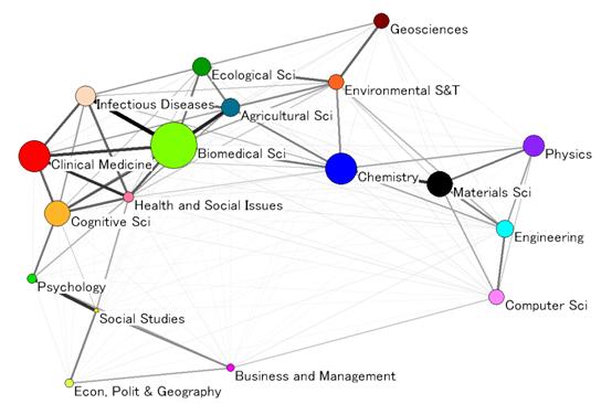
Figure 1. The
core structure of science. Cosine similarity of 18 macro-disciplines created
from factor analysis of ISI Subject Categories in 2007. The size of nodes is
proportional to number of citations produced.
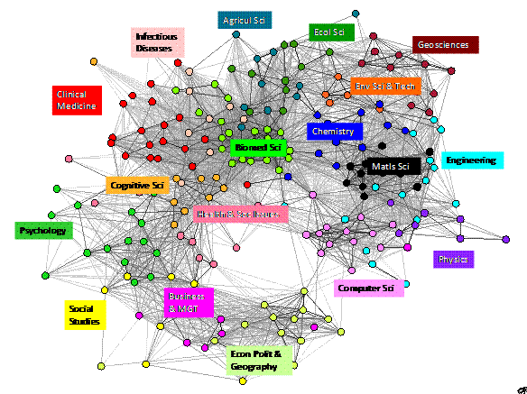
Figure 2.
Global science map based on citing similarities among ISI Subject Categories
(2007).
5.
Science overlay
maps: a novel tool for research analysis
The local science maps
are problematic for comparisons because they are not stable in the units or
positions of representation, as outlined in section 3. To overcome this, one
can use the units and the positions derived from a global map of science, but overlay
on them the data corresponding to the organisations or themes under study, as first
shown by Boyack (2009). In this section we introduce in detail a method of overlaying
maps of science. This method can be explored interactively in our webpage http://idr.gatech.edu/maps or
http://www.leydesdorff.net/overlaytoolkit. A step-by-step guide on how to construct overlay
maps is provided in Appendix 1.
To construct the
basemap, we use the subject categories (SCs) of the Web of Science to which the
ISI (Thomson Reuters) assigns journals based on journal-to-journal citation
patterns and editorial judgment. The SCs operationalise ‘bodies of specialized
knowledge’ (or subdisciplines) to enable one to track the position of articles.
The classification of articles and journals into disciplinary categories is
controversial and the accuracy of the ISI classification is open to
debate (Pudovkin & Garfield, 2002, at p. 1113n). Other classifications and
taxonomies are problematic as well (Rafols & Leydesdorff; 2009; NAS, 2009,
p. 22). Bensman & Leydesdorff (2009) argued for using the classification of
the Library of Congress, but this extension would lead us beyond the scope of
this study. However, since the global maps have been shown to be relatively robust
even when there is 50% disagreement about classifications, we pragmatically choose
the classification that has been most widely used and is most easily accessible,
despite its shortcomings (Rafols & Leydesdorff, 2009; see Appendix 2).
We follow the same
method outlined in Leydesdorff & Rafols (2009), inspired by Moya-Anegón et al. (2004). First, data were harvested from the CD-Rom version
of the Journal Citation Reports (JCR) of the Science Citation Index (SCI) and
the Social Science Citations Index (SSCI) of 2007, containing 221 Subject
Categories (SCs). This data is used to generate a matrix of citing SCs to cited
SCs with a total of 60,947,519 instances of citations between SCs. Salton’s
cosine was used for normalization in the citing direction. Pajek is used
for the visualizations (http://pajek.imfm.si)
and SPSS (v15) for the factor analysis. Figure 2 shows the global map of
science obtained using the 221 ISI SCs in 2007. Each of the nodes in the map
shows one SC, representing a subdiscipline. The lines indicate the degree of similarity
(with a threshold cutoff at a cosine similarity > 0.15)
between two SCs, with darker and thicker lines indicating stronger similarity.
The relative position of the SCs is determined by the pulls of the lines as a
system of strings, depending on the extent of similarity, based on the
algorithm of Kamada and Kawai (1989). Although in this case we used the ISI SCs,
the same method was reproduced with other classification schemes (Rafols &
Leydesdorff, 2009).
The labels and
colours in Figure 2 display 18 macro-disciplines (groupings of SCs) obtained using
factor analysis of this same matrix. The attribution of SCs to factors is
listed in the file 221_SCs_2007_Citations&Similarities.xls provided in the
supplementary materials The
choice of 18 factors was set pragmatically since it was found that the 19th
factor did not load strongly to its own elements. Figure 1, which we used above
to illustrate the discussion on the degree of consensus, shows the core
structure of science according to these18 macro-categories.
The full map of
science shown in Figure 2 provides the basemap over which we will explore
specific organisations or scientific themes using our ‘overlay’ technique. The
method is straightforward. First, the analyst retrieves a set of documents at
the Web of Science. This set of documents is the body of research to be studied
-- e.g., the publications of an organisation, or the references (knowledge
base) used in an emergent field, or the citations (audience) to the
publications of a successful laboratory. By assigning each document to a
category, the function Analyze provided in the Web of Science interface can
be used to generate a list of the number of documents present in each SC.
Uploading this list, the visualization freeware Pajek produces a map of
science in which the size of a node (SC) is proportional to the number of
documents in that category. Full details of the procedure to generate this
vector are provided in Appendix 1.
Figure 3 illustrates
the use of science overlay maps by comparing the profiles of three universities
with distinct strengths: the University of Amsterdam, the Georgia Institute of
Technology, and the London School of Economics (LSE). For each of them, the
publications from 2000 to 2009 were harvested and classified into SCs in the
Web of Science. The
maps show that the University of Amsterdam is an organisation with a diverse
portfolio and extensive research activity in clinical medicine. Georgia Tech is
strong in computer sciences, materials sciences, and engineering—as well as in applications
of engineering, such as biomedical or environmental technologies. Not
surprisingly, LSE’s main activity lies in the areas of 1) politics, economics
and geography, and 2) social studies—with some activity in the engineering and
computer sciences with social applications (e.g. statistics, information
systems, or operations research) and in the health services (e.g. heath care
and public health). To fully appreciate the descriptions, labels for each of
the nodes are needed. Although they are not presented in these figures due to
lack of resolution in printed material, labels can be switched on and off in
the computer visualisation interface, as explained in Appendix 1.
Some of the advantages
of overlay maps over local maps are illustrated by Figure 3. First, they
provide a visual framework that enables us to make immediate and intuitively
rich comparisons. Second, they use cognitive units for the representation
(disciplines and specialties) that fit with conventional wisdom, whereas one
can expect the analytical aggregates of local maps to be unstable and difficult
to interpret. Third, whereas the generation of meaningful local maps requires
bibliometric expertise, overlay maps can be produced by users of the Science
Citation Index who are not experts in scientometrics. Finally, they can be
used for various purposes depending on the units of analysis displayed by the
size of the nodes: whether number of publications, citing articles, cited
references, growth or other indicators as shown by a series of recent studies
(cf. Rafols & Meyer, forthcoming; Porter & Rafols, 2009; Porter &
Youtie, 2009).
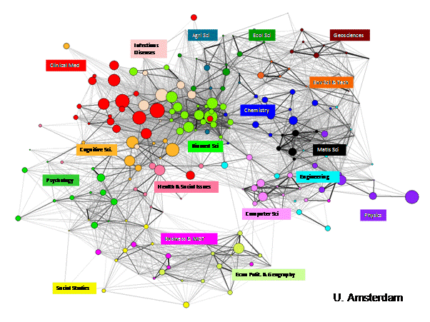
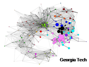
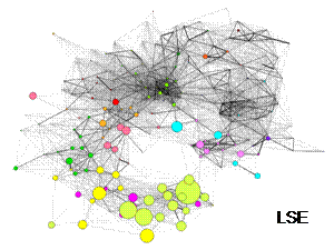
Figure 3.
Publications profiles of the University of Amsterdam, Georgia Tech and London School of Economics (LSE) overlaid on the map of science.
6.
Conditions of application
of the overlay maps
As is the case
with all bibliometric indicators, the appropriate use of overlay maps should
not be taken for granted, particularly since they are tools that can be easily
used by non-experts (Gläser & Laudel, 2007). In
this section we explore the conditions under which overlay maps can be valid
and useful for science policy analysis and management, building on Rip (1997).
A first issue
concerns the use of journals as the basic unit for classification. This is
inaccurate since journals can be expected to combine different epistemic foci,
and scientists can be expected to read sections and specific articles from
different journals (Bensman 2007). Furthermore, journal content may not
fully match specific categories. In particular, consider journals such as
Nature and Science that cover multiple fields. The ISI
includes these in their category “Multidisciplinary Sciences” (which is
factored into our Biomedical Sciences macro-discipline, even though physics,
chemistry, etc., articles appear in it). To date, we just treat this and
the seven other interdisciplinary or multidisciplinary SCs (e.g., “Chemistry,
Multidisciplinary”) the same as any other SCs.
However, the structural
similarity of maps obtained with different classifications suggests that
discrepancies and errors are not biased and therefore tend to average out when
aggregated (Rafols & Leydesdoff, 2009). Hence, the answer to the problem of
generalizing from specific or local data to a global map lies in the power of
statistics: given a sufficiently large number of assignations, there is high
probability that the largest number of publications will have been assigned
correctly. Assuming a category with an expected correct assignation of
50%, the binomial test predicts that about 70 papers are sufficient to
guarantee the correct assignation of at least 40% of the papers to this
category with a significance level of 0.05. Appendix 2 provides further details
of the binomial test and estimates of the minimum size of samples under
different constraints. These
results suggest that one should be cautious about asserting how accurately we
are “locating” a given body of research based on small numbers of papers.
Instead, for the study of single researchers or laboratories, it may be best to
rely on proxies. For example, if a researcher has 30 publications, the analyst
is advised to consider the set of references within these articles as a proxy
for the disciplinary profile (Rafols & Meyer, forthcoming).
A second set of conditions
for the overlay maps to be useful for research policy and management purposes
is transparency and traceability, i.e., being able to specify, reproduce, and
justify the procedures behind the maps in the public domain. Although the
majority of the users of the map may not be interested in the scientometric
details, the possibility to re-trace the methods and challenge assumptions is
crucial for the maps to contribute to policy debates, where transparency is a
requirement. For example, Rip (1997) noted that in the politically charged dispute
regarding the ‘decline’ of British science in the 1980s, a key issue of debate
concerned the use of static versus dynamic journal categories (Irvine et al.
1985; Leydesdorff, 1988).
A further
requirement for traceability, is relative parsimony, that is, the rule to avoid
unnecessary complexity in procedures and algorithms so that acceptable representations
can be obtained by counter-expertise or even non-experts—even at the expense of
some detailed accuracy—in order to facilitate public discussion, if needed be.
In the case of overlay maps, traceability involves making publicly available
the following choices: the underlying classifications used and/or clustering algorithms to obtain them (in our case, the ISI SC’s);
the similarity measures used among categories (Salton’s cosine similarity); and
the visualisation techniques (Kamada-Kawai with a cosine > 0.15 threshold). These minimal
requirements are needed so that the maps can be reproduced and validated independently.
A third condition
of application concerns the appropriateness of the given science overlay map for
the evaluation or foresight questions that are to be answered. Roessner’s
(2000) critique of the indiscriminate use of quantitative indicators in
research evaluation applies also to maps: without a clear formulation of the
question of what a programme or an organisation aims to accomplish, and its
context, science maps cannot provide a well-targeted answer. What type of
questions can our overlay maps help to answer? We think that they can be
particularly helpful for comparative purposes in benchmarking collaborative
activities and looking at temporal change, as described in the next section.
7.
Use in science
policy and research management
The changes that
S&T systems are undergoing exacerbate the apparent dissonance between social
and cognitive structures—with new cross-disciplinary or transversal co-ordinates
(Whitley, 2000, p. xl ; Shinn & Ragouet, 2005). As a result, disciplinary
labels of university or R&D units cannot be relied upon to provide an
accurate description of their epistemic activities. This is because researchers
often publish outside the field of their departmental affiliation (Bourke &
Butler 1998) and, further, cite outside their field of publication (Van Leeuwen
& Tijssen, 2000)—and increasingly so (Porter & Rafols, 2009).
Science overlay
maps offer a method to locate or compare positions, shifts and/or dissonances
in the disciplinary activities at different institutional or thematic levels.
This type of map (with a different basemap) was first introduced by Kevin
Boyack and collaborators to compare the disciplinary differences in the
scientific strength of nations, in the
publishing profiles of two large research organisations (Boyack, 2009, pp.
36-37), and the publication outcomes of two funding agencies (Boyack, Börner &
Klavans, 2009, p. 49). Some of us have used previous versions of the current
overlay method to
·
compare the degree of
interdisciplinarity at the laboratory level (Rafols & Meyer, forthcoming);
·
study the diffusion of
a research topic across disciplines (Kiss et al., 2009);
·
model the evolution
over time of cross-disciplinary citations in six established research fields (SCs
-- Porter & Rafols, 2009);
·
explore the
multidisciplinary knowledge bases of emerging technologies, namely
nanotechnology, as a field (Porter & Youtie, 2009) and specific sub-specialties
(Rafols et al., 2010; Huang et al., forthcoming).
The following
examples focus on applications for the purposes of benchmarking, establishing
collaboration and capturing temporal change, as illustrated with universities
(Figure 3), large corporations (Figure 4), funding agencies (Figure 5), and an
emergent topic of research (carbon nanotubes, Figure 6).
Benchmarking
A first potential
use of organisational comparisons is benchmarking: how is organisation A performing
in comparison to possible competitors or collaborators? For example a
comparison between Pfizer (Figure 4) and Astrazeneca (not shown), reveals at
first glance a very similar profile, centred around biomedical research
(pharmacology, biochemistry, toxicology, oncology) with activity both in
clinical medicine and chemistry. However, a more careful look allows spotting
some differences: whereas Pfizer has a strong profile in nephrology,
Astrazeneca is more active in gastroenterology and cardiovascular systems. This
description may be too coarse for some purposes (e.g. specific R&D investment),
but sufficient for policy-oriented analysts to discuss the knowledge base of
the firms.
Several choices
can be made regarding the data to be displayed in the maps. First, should the
map display an input (the categories of the papers cited by the
organisations), an output (the categories of a set of publications of
the organisation), or an outcome (the categories of the papers citing
the organisation’s research)? Second, should the overlay data be normalised by
the size of the category and/or the size of the organisation? [The figures here
are normalised by the size of the organisation, but not by the size of the
category; normalising by category will bring to the forefront those categories
in which one organisation is relatively very active compared to others, even if
it represents a small percentage of its production.] Third, in addition to the
number or proportion of publications per SC (or macro-discipline), other
indicators such as impact factor or growth rate indicators can be mapped (Noyons
et al., 1999; Van Raan & Van Leeuwen, 2002; or Klavans & Boyack,
forthcoming).
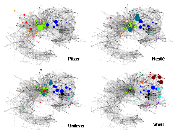
Figure 4. Profiles of the publications (2000-2009) of
large corporations of different economic sectors: pharmaceutical (Pfizer), food
(Nestlé), consumer products (Unilever), oil (Shell).
Exploring
collaborations
A second
application of the overlay maps is to explore complementarities and possible
collaborations (Boyack, 2009). For example, Nestlé’s core activities lie in
food-related science and technology. Interestingly, the map reveals that one of
its areas of highest research publication activity, the field of nutrition and
dietetics (the dark green spot in the light green cluster in Figure 4 for
Nestlé), falls much closer to the biomedical sciences than other food-related
research. This suggests that the field of nutrition may act as bridge and
common ground for research collaboration between the food and pharmaceutical
industry—sectors that are approaching one another, as shown by Nestlé’s
strategic R&D investment in ‘functional’ (i.e. health-enhancing) foods (The
Economist, 2009).
In Figure 5, we
compare funding agencies in terms of potential overlap. The funding
agencies in the US and the UK have, in principle, quite differentiated remits.
In the US (top of Figure 5), the NIH (National Institute of Health) focuses on
biomedical research while the NSF (National Science Foundation) covers all
basic research. In the UK (bottom of Figure 5), the BBSRC (Biotechnology and
Biological Sciences Research Council) and the EPSRC (Engineering and Physical
Sciences Research Council) are expected to cover the areas described in their respective
names. However, Figure 5 reveals substantial areas of overlap. These are areas
where duplication of efforts could be occurring—suggesting a case for
coordination among agencies. It may also help indentify interdisciplinary
topics warranting express collaboration between committees from two agencies,
such as the interaction of the BBSRC and EPSRC on Engineering and Biological
Systems.
The exploration of
collaboration practices is a topic where overlay maps provide added value
because they implicitly convey information regarding the cognitive distance
among the potential collaborators. A variety of studies (Llerena &
Meyer-Krahmer, 2004; Cummings & Kiesler, 2005; Noteboom et al., 2007; Rafols,
2007) have suggested that successful collaborations tend to occur in a middle
range of cognitive distance, whereupon the collaborators can succeed at
exchanging or sharing complementary knowledge or capabilities, while still
being able to understand and coordinate with one another. At short cognitive distances,
the benefits of collaboration may be too low to be worth the effort (or
competition may be too strong), while at large distances, understanding between
partners may become difficult. It remains an empirical question whether one may
think of an ‘optimal cognitive distance’ which would allow formulating a
research project with ‘optimal diversity’ (Van den Bergh, 2008).
In any case,
overlay maps offer a first (yet crude) method to explore complementarities
between prospective partners. US managers of grant programmes for highly innovative
research pointed out to us that the science overlay maps might be useful for
finding partners, as well as for evaluating prospective grantees. The
U.S. National Academies Keck Futures Initiative (NAKFI) has found it helpful to
overlay research publications pertaining to a prospective workshop topic
(synthetic biology) to help identify research communities to include.
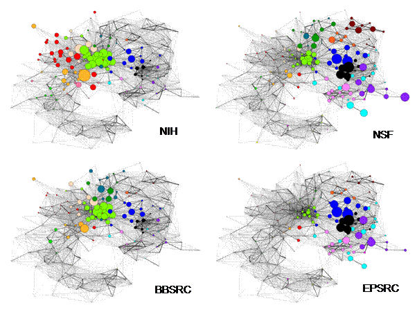
Figure 5. Publication profile of funding agencies in
the US (top) and the UK (bottom).
Capturing
temporal change
A third use of
overlap maps is to compare developments over time. This allows exploring the diffusion
of research topics across disciplines (Kiss et al., 2009). In cases where the
research topic is an instrument, a technique or a research material, the spread
may cover large areas of the science map (as noted by Price, 1984, p. 16). Figure
6 shows the location of publications on carbon-nanotubes (left) and its areas
of growth (right). The growth rate was computed by calculating the annual
growth between 2004 and 2008 and taking the average over the period. Since
their discovery in 1991, carbon-nanotubes research has shown exponential
growth, first in the areas of materials sciences and physical chemistry
(Lucio-Arias & Leydesdorff, 2007). However, nowadays the highest growth can
be observed in computer sciences due to electronic properties of carbon-nanotubes
(pink), in medical applications (red: e.g., imaging and biomedical
engineering), and both in biomedical research (green: e.g. pharmacology and
oncology) and in environmental research (orange). Within the dominant areas of
chemistry and materials sciences (blue and black), growth is highest in applied
fields, such as materials for textiles and biomaterials. The overlay
methodology thus offers a perspective of the shift of carbon-nanotubes research
towards applications and issues of health and environmental safety. Alternatively
to a static display of growth rate, the overlay maps can make a “movie” of the
evolution of a field (e.g., via a succession of Powerpoint time-slice slides;
this works because of the stable basemap).
Comparison over
time can also be interesting in order to track developments in organisations.
For example, Georgia Tech, traditionally an engineering-centred university
without a medical school, recently created the School of BioMedical Engineering.
Going back to Figure 3, we can see a medium-size red spot in Georgia Tech
publications corresponding to biomedical engineering. A dynamic analysis would
depict how this has grown in the last decade.
Since the
rationales of research policy, evaluation and management are more complex than
bibliometric indicators or maps can be, science overlay maps will usually
provide complementary inputs to support (and sometimes to justify) decisions.
Other possible uses include finding reviewers for the assessment of
interdisciplinary research in emergent fields, or finding valid benchmarks when
comparing organisations (Laudel & Gläser, 2009).
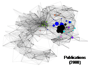
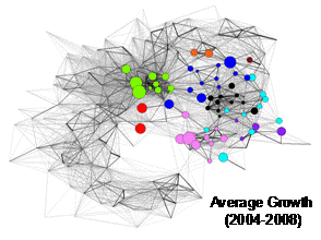
Figure 6. Publications (2008) and average annual growth
of publications (2004-2008) on carbon nanotubes.
8.
Advantages and limitations
of overlays
We noted above as some major advantages and downsides
of overlay maps: on the plus side, their readability, intuitive and heuristic
nature; on the minus side, the inaccuracy in the attribution to categories and
the possible error by visual inspection of cognitive distance given the
reduction of dimensions. In this section, we explore further potential
benefits of maps in terms of cognitive contextualisation and capturing diversity,
and its main limitation, namely its lack of local relational structures.
Contextualising categories
Science overlay
maps provide a concise way to contextualise previously existing information of
an organisation or topic, in a cognitive space. The same information overlaid
on the maps may well have been provided in many previous studies in tabular or bar
chart format. For example, policy reports (e.g., Van Raan & Van Leeuwen, 2002)
may extensively show the outcomes of a research programme via tables and bar
charts: fields of publication, user fields, relative impacts, changes of these
indicators over time, etc. What would the overlay maps offer more than this? In
our opinion, these maps provide the contextualisation of the data. This extension
not only facilitates the comprehension of sets of data, but also their correct
interpretation. Unlike bar charts and tables based on categories, the overlay
maps remain valid (statistically acceptable) despite possible errors in the classifications.
The reason is that, whereas different classifications may produce notably
different bar charts, in corresponding maps ‘misclassified’ articles fall in
nearby nodes and the user may still be provided with an adequate pattern. The
context can thus reduce perceptual error.
For example, let
us consider the new ISI SC of Nanoscience and Nanotechnology. A study of
a university department in materials science during the 2000s might suggest a
strong shift towards nanotechnology based on considering bar charts that show
its strong growth in this new SC. However, on a global map of science, this new
SC, Nanoscience and Nanotechnology, locates extremely closely to other
core disciplines in Materials Sciences. Therefore, one would appreciate this
change as a relatively small shift in focus, rather than a major cognitive
shift. If a department under study had fully ventured into more
interdisciplinary nanotechnology, its publications would also increasingly be
visible in more disparate disciplines, for example, in the biomedical or
environmental areas (Porter & Youtie, 2009).
Capturing
diversity
Science overlay
maps provide the user with a perspective of the disciplinary diversity of any
given output, yet without the need to rely on combined or composite indices. Research
organisations often seek a diverse cognitive portfolio, but find it difficult
to assess whether the intended diversity is achieved. However, diversity
encapsulates three entangled aspects (variety, balance, and disparity) which
cannot be univocally subsumed under a single index (Stirling, 2007), but are differently
reflected in these maps:
·
First, the maps capture
the variety of disciplines by portraying the number of disciplines (nodes)
in which a research organisation is engaged;
·
Second, they capture
the disciplinary balance by plotting the different sizes of the SC nodes;
·
Third—different from,
say, bar charts—maps can convey the disparity (i.e. the cognitive
distances) among disciplines by placing these units closer or more distant on
the map (Rafols & Meyer, forthcoming).
This spatial
elaboration of diversity measures is particularly important when comparing
scientific fields in terms of multi- or interdisciplinarity. For example,
Porter & Rafols (2009) show that in fields such as biotechnology, many
disciplines are cited (high variety, a mean of 12.7 subject categories cited per
article in 2005), but they are mainly cited in the highly dense area around
biomedical sciences (low disparity). In contrast, atomic physics publications cite
fewer disciplines (a mean of 8.7 per article), but from a more diverse
cognitive area, ranging from physics to materials science and chemistry (higher
disparity).
This discussion
highlights that overlay maps are useful to explore interdisciplinary
developments. In addition to capturing disciplinary diversity, they can also help
to clarify the relative location of disciplines and thereby enable us to gain
insights of another of the aspects of interdisciplinary research, namely their
position in between or central (or marginal) to other research areas
(Leydesdorff, 2007). Unlike indicators that seek to digest multiple
facets to a single value or ranking of the extent of “interdisciplinarity,” maps
invite the analyst to more reflexive explorations and provide a set of perspectives
that can help to open the debate. This plurality is highly commendable given
the conspicuous lack of consensus on the assessment of interdisciplinarity (Rinia
et al. 2001, Morillo et al., 2003; Bordons et al., 2004; Leydesdorff,
2007; Porter et al. 2007; Rafols & Meyer, forthcoming; see review by
Wagner et al., submitted).
Missing the relational structure
The two characteristics that make overlay maps so
useful for comparisons, their fixed positional and cognitive categories, are
also inevitably, their major limitations and a possible source of
misreading. Since the position in the map is only given by the
attribution in the disciplinary classification, the resulting map does not teach
us anything about the direct linkages between the nodes. For example, Figure 3
shows that the University of Amsterdam covers many disciplines—but we do not
know at all whether its local dynamics is organised within the disciplines
portrayed or according to a variety of themes transversal to a collection of
SCs. In order to investigate this, one would need to create local maps, as
described in Section 3. For most local purposes these maps will be based on smaller
units of analysis, such as words, publications or journals, rather than SCs.
In our opinion, a particularly helpful option is to
combine overlay maps (based on a top-down approach, with fixed and given categories)
with local maps (based on a bottom-up approach, with emergent structures), in
order to capture the dynamics of an evolving field (Rafols & Meyer, forthcoming;
Rafols et al., 2010; Rosvall & Bergstrom, 2009). A recursive combination of
overlay and local maps allows us to investigate the evolution of a field both
in terms of its internal cognitive coherence and the diversity of its knowledge
sources with reference to disciplinary classifications (external).
9.
Conclusions
Science overlay
maps offer a straightforward and intuitive way of visualising the position of
organisations or topics in a fixed map based on conventional disciplinary
categories. By thus standardizing the mapping, one can produce comparisons
which are easy to grasp for science managers or policy-makers. For example, one
can assess a research portfolio of a university or animate a diffusion pattern
of an emergent field.
In this study, we
have introduced the bases for the use of overlay maps to prospective non-expert
users and described how to create them. We demonstrated that the emergent
consensus on the structure of science enables us to generate and warrant a
stable global template to use as a basemap. We introduced the
conditions to be met for a proper use of the maps, including a sample size of
statistical reliability, and the requirements of transparency and traceability.
We provided examples of benchmarking, search of collaborations and examination
of temporal change in applications to universities, corporations, funding agencies
and emergent topics.
In our opinion, overlay
maps provide significant advantages in the readability and contextualisation of
disciplinary data and in the interpretation of cognitive diversity. As it is
the case with maps in general, overlays are more helpful than indicators to
accommodate reflexive scrutiny and plural perspectives. Given the potential
benefits of using overlay maps for research policy, we provide the reader with
an interactive webpage to explore overlays (http://idr.gatech.edu/maps) and a freeware-based toolkit (available at http://www.leydesdorff.net/overlaytoolkit
).
return
Acknowledgements
ALP and IR acknowledge
support from the US National Science Foundation (Award #0830207, ‘Measuring and
Tracking Research Knowledge Integration’, http://idr.gatech.edu/ ). The findings and observations contained
in this paper are those of the authors and do not necessarily reflect the views
of the National Science Foundation. IR is partially supported by the EU FP7 project
FRIDA, grant 225546. We are indebted to K. Boyack, R. Klavans, F. de
Moya-Anegón, B. Vargas-Quesada and M. Zitt for insights and discussions.
References
Abbot, A. (2001). Chaos of disciplines.
Chicago, The University of Chicago Press.
Balaban, A. T. & Klein, D. J. (2006). Is chemistry
"The Central Science"? How are different sciences related?
Cocitations, reductionism, emergence, and posets. Scientometrics, 69,
615-637.
Bapteste, E., O'Malley, M. A., Beiko, R. G.,
Ereshefsky, M., Gogarten, J. P., Franklin-Hall, L., Lapointe, F.-J., Dupré, J.,
Dagan, T., Boucher, Y. & Martin, W. (2009). Prokaryotic evolution and the
tree of life are two different things. Biology Direct, 4(34), 1-20.
Bensman, S. J. (2007). Garfield and the impact factor.
Annual Review of Information Science and Technology, 41(1), 93-155.
Bensman, S. J., & Leydesdorff, L. (2009).
Definition and Identification of Journals as Bibliographic and Subject
Entities: Librarianship vs. ISI Journal Citation Reports (JCR) Methods and
their Effect on Citation Measures. Journal of the American Society for
Information Science and Technology, 60(6), 1097-1117.
Bollen, J., Van de Sompel, H., Hagberg, A.,
Bettencourt, L., Chute, R., Rodriguez, M. A. and Balakireva, L. (2009).
Clickstream data yields high-resolution maps of science. PLoS ONE 4(3), e4803.
Bordons, M., Morillo, F. and Gómez, I. (2004).
Analysis of cross-disciplinary research through bibliometric tools. Handbook of
quantitative science and technology research. H. F. Moed, W. Glänzel and U.
Schmoch. Dordrecht, Kluwer: 437-456.
Börner, K., Chen, C. and Boyack, K. W. (2003).
Visualizing knowledge domains. Annual Review of Information Science &
Technology 37, 179-255.
Bourke, P. & Butler, L. (1998). Institutions and
the map of science: matching university departments and fields of research. Research
Policy, 26, 711–718.
Bowker, G. C. and Star, S. L. (2000). Sorting
things out: Classification and its consequences. Cambridge, MA, MIT Press.
Boyack, K. W. (2009). Using detailed maps of science
to identify potential collaborations. Scientometrics, 79(1), 27-44.
Boyack, K. W., Klavans, R. & Börner, K. (2005). Mapping the backbone of science. Scientometrics,
64(3), 351-374.
Boyack, K. W., Börner, K. & Klavans, R. (2009). Mapping the structure and evolution of
chemistry research. Scientometrics, 79(1), 45-60.
Callon, M., Law, J. and Rip, A., Eds. (1986). Mapping
the dynamics of science and technology : Sociology of science in the real
world. London, MacMillan.
Cambrosio, A., Keating, P., Mercier, S., Lewison, G. &
Mogoutov, A. (2007). Mapping the emergence and development of translational
cancer research. European Journal of Cancer, 42, 3140-3148.
Cummings, J. N. & Kiesler, S. (2005). Collaborative research across disciplinary
and organizational boundaries. Social Studies of Science, 35(5),
733-722.
Dupré, J. (1993). The Disorder of Things.
Metaphysical Foundations of the Disunity of Science. Cambridge, MA: Harvard
University Press.
Etzkowitz, H. & Leydesdorff, L. (2000). The
dynamics of innovation: from National Systems and "Mode 2" to a
Triple Helix of university-industry-government relations. Research
Policy, 29, 109-123.
Galison, P. & Stump, D. J., Eds. (1996). The
disunity of science: boundaries, context and power. Stanford, CA, Stanford
University Press.
Garfield, E. (1987). Launching the ISI Atlas of
Science: for the new year, a new generation of reviews. Current Contents, 1,
1-6.
Gibbons, M., Limoges, C., Nowotny, H., Schwartzman,
S., Scott, P. & Trow, M. (1994). The New Production of Knowledge: The
Dynamics of Science and Research in Contemporary Societies. London, Sage.
Gläser, J. and Laudel, G. (2007). The social
construction of bibliometric evaluations. The changing governance of the
sciences. R. Whitley and J. Gläser. Amsterdam, Springer: 101-123.
Hessels, L. K. and Van Lente, H. (2008). Re-thinking new knowledge production: A
literature review and a research agenda. Research Policy 37, 740-760.
Hicks, D. (1987). Limitations of co-citation analysis
as a tool for science policy. Social Studies of Science 17, 295-316.
Huang, L., Guo, Y., & Porter, A.L. (forthcoming).
Identifying Emerging Roles of Nanoparticles in Biosensors, Journal of
Business Chemistry.
Irvine, J., Martin, B., Peacock, T., & Turner, R.
(1985). Charting the decline of British science. Nature, 316, 587-590.
Janssens, F., Zhanga, L., Moorc, B. D. and Glänzel, W.
(2009). Hybrid clustering for validation
and improvement of subject-classification schemes. Information Processing and
Management 45(6), 683-702.
Katz, J. S. (1999). The self-similar science system.
Research Policy 28(5), 501-517
Kamada, T., & Kawai, S. (1989). An algorithm for
drawing general undirected graphs. Information Processing Letters, 31(1),
7-15.
Kiss, I. Z., Broom, M., Craze, P. & Rafols, I.
(2010). Can epidemic models describe the diffusion of research topics across
disciplines? Journal of Informetrics, DOI: 10.1016/j.joi.2009.08.002.
Klavans, R. & Boyack, K. W. (2008). Thought
leadership: A new indicator for national and institutional comparison.
Scientometrics, 75(2), 239-250.
Klavans, R. & Boyack, K. W. (2009). Toward a
Consensus Map of Science. Journal of the American Society for Information
Science and Technology, 60(3), 455-476.
Klavans, R. & Boyack, K. W. (forthcoming). Toward
an objective, reliable and accurate method for measuring research leadership. Scientometrics.
Klein, J. T. (2000). A conceptual vocabulary of
interdisciplinary science. In Practising interdisciplinarity. P.
Weingart & N. Stehr, Eds. Toronto, University of Toronto Press: 3-24.
Knorr-Cetina, K. (1999). Epistemic cultures. How
the sciences make knowledge. Cambridge, MA, Harvard University Press.
Laudel, G. & Gläser, J. (2009). Interdisciplinarity
as criterion and condition of evaluations. Paper presented at the Workshop on
Interdisciplinarity in the 2009 ISSI Conference, Rio de Janeiro, July 2009.
Lenoir, T. (1997). Instituting science. The
cultural production of scientific disciplines. Stanford, Stanford
University Press.
Leydesdorff, L. (1986). The Development of Frames of
References. Scientometrics 9, 103-125.
Leydesdorff, L. (1987). Various methods for the
Mapping of Science. Scientometrics 11, 291-320.
Leydesdorff, L. (1988). Problems with the
'measurement' of national scientific performance. Science and Public Policy,
15, 149-152.
Leydesdorff, L. (2006). Can Scientific Journals be
Classified in Terms of Aggregated Journal-Journal Citation Relations using the
Journal Citation Reports? Journal of the American Society for Information
Science & Technology, 57(5), 601-613.
Leydesdorff, L. (2007). Betweenness centrality as an
indicator of the interdisciplinarity of scientific journals. Journal of the
American Society for Information Science & Technology, 58(9), 1303-1319.
Leydesdorff, L., Cozzens, S. E., & Van den
Besselaar, P. (1994). Tracking
Areas of Strategic Importance using Scientometric Journal Mappings. Research
Policy, 23, 217-229.
Leydesdorff, L. & Rafols, I. (2009). A Global Map
of Science Based on the ISI Subject Categories. Journal of the American
Society for Information Science & Technology, 60(2), 348-362.
Llerena, P. & Meyer-Krahmer, F. (2004).
Interdisciplinary research and the organization of the university: general
challenges and a case study. Science and Innovation. In Rethinking the
Rationales for Funding and Governance. A. Geuna, A. J. Salter and W. E.
Steinmueller. Eds. Cheltenham, Edward Elgar: 69-88.
Lucio-Arias, D. & Leydesdorff, L.
(2007). Knowledge emergence in
scientific communication: From “fullerenes” to “nanotubes”. Scientometrics
70(3), 603-632.
Martin, B.R. (1997). The use of multiple indicators in
the assessment of basic research. Scientometrics, 36(3), 343-362.
Maturana, H. R., & Varela, F. J. (1984). The
Tree of Knowledge. Boston: New Science Library.
Morillo, F., Bordons, M. & Gómez, I. (2003). Interdisciplinarity in science: A tentative
typology of disciplines and research areas. Journal of the American Society for
Information Science and Technology, 54(13), 1237 - 1249.
Moya-Anegón, F., Vargas-Quesada, B., Victor
Herrero-Solana, Chinchilla-Rodríguez, Z., Elena Corera-Álvarez &
Munoz-Fernández, F. J. (2004). A
new technique for building maps of large scientific domains based on the
cocitation of classes & categories. Scientometrics, 61(1), 129-145.
Moya-Anegón, F., Vargas-Quesada, B.,
Chinchilla-Rodríguez, Z., Corera-Álvarez, E., Munoz-Fernández, F. J. &
Herrero-Solana, V. (2007). Visualizing
the marrow of science. Journal of the American Society for Information Science
& Technology, 58, 2167–2179.
NAS (2009) Data on Federal Research and Development
Investments: A Pathway to Modernization. National Academies Press,
Washington D.C. Available at http://www.nap.edu/catalog/12772.html,
accessed November 20th, 2009.
Neurath, O. (1932/1933). Protokollsätze. Erkenntnis, 3,
204-214.
Nooteboom, B., Haverbeke, W. V., Duysters, G.,
Gilsing, V. & van den Oord, A. (2007). Optimal cognitive distance and absorptive capacity. Research
Policy 36, 1016–1034.
Noyons, E. (2001). Bibliometric mapping of science in
a science policy context. Scientometrics, 50(1), 83-98.
Noyons, C. M. (2004). Science maps within a science
policy context. Handbook of quantitative science & technology research.
H. F. Moed, W. Glänzel & U. Schmoch. Dordrecht, Kluwer: 237-255.
Noyons, E. C. M. and Raan, A. F. J. v. (1998). Monitoring scientific developments from a
dynamic perspective: Self-organized structuring to map neural network research.
Journal of the American Society for Information Science 49, 68-81.
Noyons, E. C. M., H. Moed & M. Luwel (1999). Combining
mapping and citation analysis for evaluative bibliometric purposes. Journal
of the American Society for Information Science 50(2), 115-131.
Porter, A. L., Cohen, A. S., Roessner, J. D. &
Perreault, M. (2007). Measuring researcher interdisciplinarity. Scientometrics,
72(1), 117-147.
Porter, A. L. & Rafols, I. (2009). Is Science Becoming more Interdisciplinary?
Measuring and Mapping Six Research Fields over Time. Scientometrics,
81(3), 719-745.
Porter, A.L., & Youtie, J. (2009). Where Does Nanotechnology Belong in the Map of
Science?, Nature-Nanotechnology, 4, 534-536.
Price, D. J. de Solla (1965). Networks of scientific
papers. Science, 149, 510- 515.
Price, D. J. de Solla (1984). The science/technology
relationship, the craft of experimental science, and policy for the improvement
of hight technology innovation. Research Policy 13, 3-20.
Pudovkin, A. I. and Garfield, E. (2002). Algorithmic
procedure for finding semantically related journals. Journal of the American
Society for Information Science and Technology 53(1113-1119), 11.
Rafols, I. (2007). Strategies for knowledge
acquisition in bionanotechnology: Why are interdisciplinary practices less widespread
than expected?. Innovation: the European Journal of Social Science Research,
20(4), 395-412.
Rafols, I. & Leydesdorff, L. (2009). Content-based
and Algorithmic Classifications of Journals: Perspectives on the Dynamics of
Scientific Communication and Indexer Effects. Journal of the American
Society for Information Science & Technology, 60(9) 1823-1835.
Rafols, I. & Meyer, M. (forthcoming). Diversity and
Network Coherence as indicators of interdisciplinarity: case studies in
bionanoscience. Scientometrics, DOI 10.1007/s11192-009-0041-y.
Rafols, I., Park, J.-H. & Meyer, M. (2010). Hybrid
nanomaterial research: is it really interdisciplinary? In The Supramolecular
Chemistry of Organic- Inorganic Hybrid Materials. K. Rurack & R.
Martínez- Máñez. Eds. Hoboken,
NJ, US, John Wiley & Sons.
Rinia, E. J., Van Leeuwen, T. N., Bruins, E. P. W.,
Van Buren, H. G. & Van Raan, A. F. J. (2002). Measuring knowledge transfer between fields of
science. Scientometrics, 54, 347–362.
Rip, A. (1997). Qualitative conditions of
scientometrics: The new challenges. Scientometrics 38(1), 7-26.
Roessner, D. (2000). Quantitative and qualitative
methods and measures in the evaluation of research Research Evaluation 9(2),
125-132.
Rosvall, M. & Bergstrom, C. T. (2009). Mapping change in large networks.
arXiv:0812.1242v1.
Small, H. G. (1977). A co-citation model of a
scientific specialty: A longitudinal study of collagen research. Social Studies
of Science 7, 139-166.
Simon, H. A. (1973). The Organization of Complex
Systems. In H. H. Pattee (Ed.), Hierarchy Theory: The Challenge of Complex
Systems (pp. 1-27). New York: George Braziller Inc.
Shinn, T. & Ragouet, P. (2005). Controverses
sur la science. Pour une sociologie transversaliste de l'activité scientifique.
Paris, Raisons d'agir.
Small, H. (1973). Co-citation in the Scientific
Literature: A New measure of the Relationship between Two Documents. Journal
of the American Society for Information Science, 24(4), 265-269.
Small, H. (1999). Visualizing science by citation
mapping. Journal of the American Society for Information Science 50(9),
799-813.
Small, H., &
Griffith, B. (1974). The Structure of Scientific Literature I. Science
Studies 4, 17-40.
Small, H., & Sweeney, E. (1985). Clustering the
Science Citation Index Using Co-Citations I. A Comparison of Methods,. Scientometrics
7, 391-409.
Small, H., Sweeney, E., & Greenlee, E. (1985).
Clustering the Science Citation Index Using Co-Citations II. Mapping Science,. Scientometrics
8, 321-340.
Weingart, P. and Stehr, N., Eds. (2000). Practising
interdisciplinarity. Toronto, University of Toronto Press.
Stirling, A. (2007). A general framework for analysing
diversity in science, technology and society. Journal of The Royal Society
Interface, 4(15), 707-719.
Stirling, A. (2008). "Opening up" And
"Closing down": Power, participation, and pluralism in the social
appraisal of technology. Science, Technology & Human Values 33(2), 262-294.
Studer, K. E., & Chubin, D. E. (1980). The
Cancer Mission. Social Contexts of Biomedical Research. Beverly Hills.:
Sage.
The Economist (2009) Nestlé. The unrepentant chocolotier. October
29th 2009.
Tijssen, R., de Leeuw, J., & van Raan, A. F. J.
(1987). Quasi-Correspondence Analysis on Square Scientometric Transaction
Matrices. Scientometrics 11, 347-361.
Van den Bergh, J. C. J. M. (2008). Optimal diversity:
Increasing returns versus recombinant innovation. Journal of Economic Behavior & Organization 68, 565-580.
van den Besselaar, P. and Leydesdorff, L. (1996).
Mapping change in scientific specialties: A scientometric reconstruction of the
development of artificial intellingence. Journal of the American Society for
Information Science 46(6), 415-436.
Van den Daele, W., Krohn, W., & Weingart, P.
(Eds.). (1979). Geplante Forschung: Vergleichende Studien über den Einfluss
politischer Programme auf die Wissenschaftsentwicklung. Frankfurt a.M.: Suhrkamp.
Van Eck, N.J. & Waltman, L. (2009)
VOSviewer: A computer program for bibliometric mapping. In B. Larsen & J.
Leta, editors, Proceedings of the 12th International Conference on
Scientometrics & Informetrics, pp. 886-897.
Van Leeuwen, T. & Tijssen, R. (2000). Interdisciplinary dynamics of modern
science: Analysis of cross-disciplinary citation flows. Research Evaluation, 9(3), 183-187.
Van Raan, A. F. J. & van Leeuwen, T. N. (2002). Assessment of the scientific basis of
interdisciplinary, applied research. Application of bibliometric methods in
Nutrition and Food Research. Research Policy 31, 611-632.
Wagner, C. S., Roessner, J. D., Bobb, K., Klein, J.
T., Boyack, K. W., Keyton, J., Rafols, I. & Börner, K. (Submitted).
Approaches to Understanding and Measuring Interdisciplinary Scientific Research
(IDR): A Review of the Literature. Journal of Informetrics.
Weingart, P. & Stehr, N., Eds. (2000). Practising
Interdisciplinarity. Toronto, University of Toronto Press.
Weingart, P. (2000). Interdisciplinarity: the
paradoxical discourse. In Practising interdisciplinarity. P. Weingart &
N. Stehr. Eds. Toronto, University of Toronto Press: 25-41.
White, H. D. and McCain, K. W. (1998). Visualizing a
discipline: An author co-citation analysis of information science, 1972-1995.
Journal of the American Society for Information Science 49(9), 327-355.
Whitley, R. (2000). The intellectual and social
organisation of the sciences. Oxford, Oxford Universidy Press, 2nd Edition.
Woolgar, S. (1991). Beyond the citation debate:
Towards a sociology of measurement technologies and their use in science
policy. Science and Public Policy 18(5), 319-326.
Appendix 1: A
user-friendly method for the generation of overlay maps
We follow the
method introduced in Rafols & Meyer (forthcoming) to create the overlay map
on the basis of a global map of science (Leydesdorff & Rafols, 2009). The
steps described below rely on access to the Web of Science and the files
available in our mapping kit (http://www.leydesdorff.net/overlaytoolkit). The objective is to obtain the set of
SCs for a given set of articles; provide this to network software (we describe
for Pajek); and output as overlay information to add to a suitable
basemap.
First, the analyst
has to conduct a search in the Thomson Reuters Web of Science (www.isiknowledge.com). Non-expert users
should note that this initial step is crucial and should be done carefully:
authors may come with different initials, addresses are often inaccurate, and
only some types of document ,may be of interest (e.g., only so-called citable
items: articles, proceedings papers, reviews, and letters).
Once the analyst has chosen a set of documents from searches at Web of Science,
one can click the tab, Analyze results. In this new webpage, the
selected document set can then be analysed along various criteria (top left hand
tab). The Subject Area choice produces a list with the number of
documents in each Subject Category. This list can be downloaded as Analyze.txt.
In the next step the analyst can go to our webpage for maps (http://idr.gatech.edu/maps ) and upload this file .
If one analyst desires
more control on the process, she can use the programme Pajek and the associated
overlaytoolkit. After opening Pajek, press F1 and upload the basemap file SC2007-015cut-2D-KK.paj.
This files provide the basemap, as
shown by selecting Draw>Draw-Partition-Vector (or pressing Ctrl-P).
Then the previously downloaded Analyze.txt file has to be transformed by
the mini-programme SC2007.exe (in our tool kit) as into the Pajek vector
format “SC07.vec” This file can be uploded into Pajek by choosing File>Vector>Read
from the main Pajek menu. Selecting from the menu Draw>Draw-Partition-Vector
(alternatively, pressing Ctrl-Q), the overlay map will be generated.
At this stage, the size of nodes will often need adjustment, which can be done
by selecting Options>Sizeof Vertices in the new draw window. In order
to have the standard colour settings, the file SC2007-18Factors-ColourSettings.ini
can be loaded by going to Options>Ini File>Load in the main
Pajek window. Crtl-L and Ctrl-D allow visualise and delete,
respectively, the labels of each SC. Clickling on nodes allows to move SC to
other positions. The image can be exported selecting Export>2D>Bitmap
in the menu of the Draw window. A further optional step would be to
label the map in terms of factors, by importing this image into powerpoint in
order to label groups of clusters, as shown in the file SC2007 Global
maps.ppt.
An alternative
procedure for more experienced users is to download the records of a document
set found in the Web of Science. This is done by adding the Marked list (bottom
bar) the desired documents; second, going to Marked list (top bar) and
then downloading the documents in a Tagged Field format after selecting Subject
category as one of the fields to download. The downloaded file should be
renamed as data.txt and used as input into the program ISI.exe
(available at http://www.leydesdorff.net/software/isi).
One of the outputs of the programmes ISI.exe is the file SC07.vec that
can be used in Pajek as explained above. The advantage of this procedure is
that ISI.exe also produces other files with information on fields such as
author or journal that may be of interest. Feel free to contact the authors in
case of difficulty.
Appendix 2:
Estimation of number of papers needed for reliability in overlay maps
In a previous
study, Rafols & Leydesdorff (2009) found that there is between 40-60% of
disagreements between attributions of journals to disciplinary categories.
Taking a conservative approach, let us assume that for a sample of N
papers, there is a probability p=0.5 that they will be misclassified by
a given classification (whatever the one that is used). How large should a sample
of papers be so that, in spite of the error, the largest categories in the
distribution correctly represent the core discipline of the population?
Let us then assume
that we have N papers of one given category A. Given the p=0.5
probability of correct assignation, we only expect 50% of the papers in
category A. The analyst has then to arbitrarily choose a lower threshold m
(we suggest 40%), as the minimum percentage acceptable, with a given degree of
significance (we suggest s=0.05,
corresponding to a z-score of 1.65). Since a given paper can either be
correctly or incorrectly assigned to a category, we can use the binomial
distribution to make a binomial test. For N ≥ 50 and Np(1 – p)
≥ 9, the binomial distribution can be approximated to the normal
distribution, with the following z-score:
For a given degree
of significance s, the associated z-score
allows us to calculate then the minimum size of the population N to
guarantee that the correct category A will have at least a proportion m in
the sample.
Assuming a degree
of mis-classification of 50%, enforcing a lower acceptance threshold of 40% and
a significance level of s=0.05,
one obtains that the sample should be larger than approximately 70 papers (140
papers would increase the significance level to s=0.01). Table 1 shows the number of papers needed
under different assumptions.
Table 1.
Approximate number of papers recommended for the reliable identification of
a category in an overlay map
|
p
(Prob.
disagreement)
|
m
(Lower tolerance)
|
s
(Significance
level)
|
Minimuml number
of papers needed
|
|
0.5
|
0.4
|
0.10
|
41
|
|
0.5
|
0.4
|
0.05
|
68
|
|
0.5
|
0.4
|
0.01
|
135
|
|
0.6
|
0.5
|
0.05
|
65
|
|
0.4
|
0.3
|
0.05
|
65
|
These results teach
us the number of papers N needed in the populated categories to have
some certainty. This means that the actual number of papers per overlay map
depends on how narrow or wide is the distribution of disciplinary categories. The
more skewed the distribution, the fewer papers are needed. Taking the example
of Figure 3, one can estimate that in diverse universities such as Amsterdam or
Sussex 3,000 publications may be needed to capture precisely the five top
disciplines, whereas for focused organisations such as the European Molecular
Biology Laboratory (EMBL), 1,500 publications could be enough.
In our opinion, these
are rather conservative estimates, having set at p=0.5 of
mis-assignation. If one allows for ‘near-misses’ (i.e. assignation to the two
nearest categories to be counted as correct) then p can be estimated in the
range of 0.70 to 0.85 (Rafols & Leydesdorff, 2009). In this
case only some dozens of papers are needed to achieve m~0.5. (but in
this case, the normal distribution approximation cannot be used for the
estimate).
return